+44 (0) 1326 744776[email protected]
Uncommon Clarity. Enduring Craft.
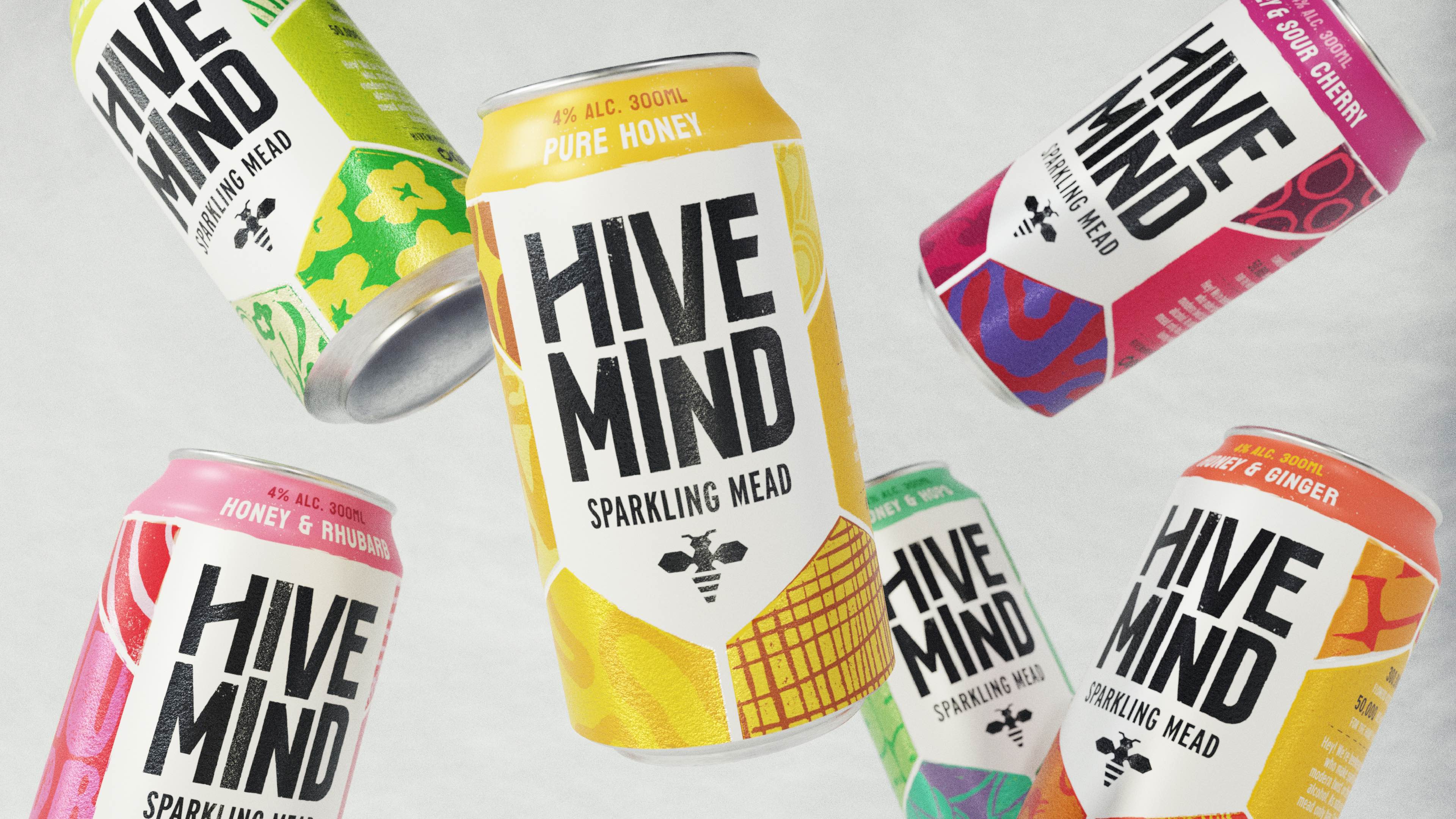
Making Mead Mainstream
Hive Mind
An elevated brand experience for an elevated drinking experience.
58 and Co.
An opulent British twist on the traditional aperitif
Sipello
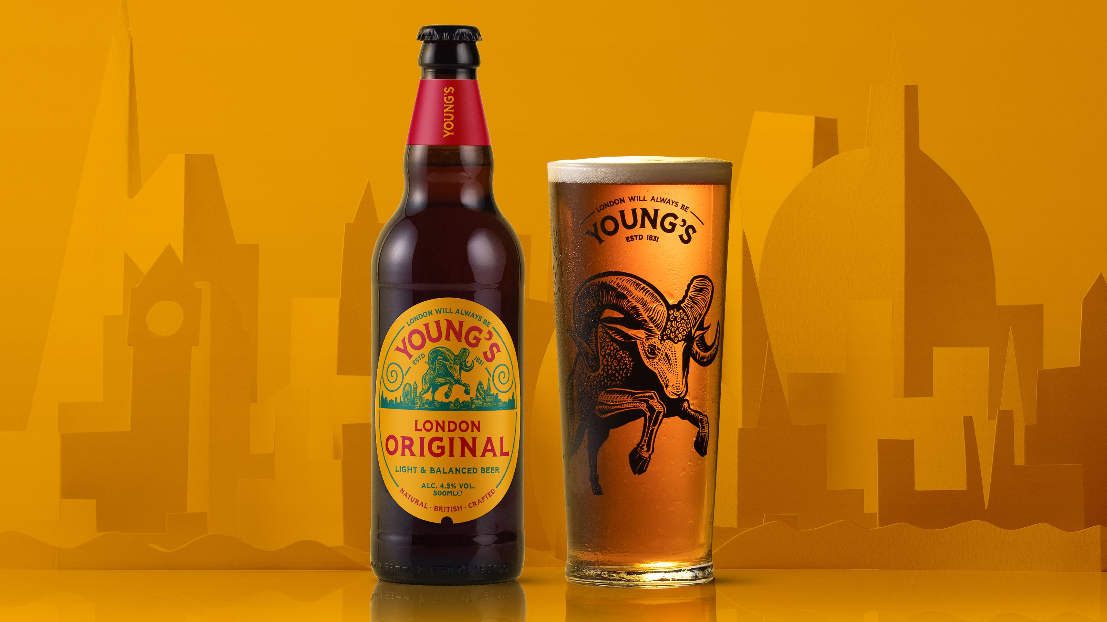
Progressive heritage brewery rebrand
Young’s Brewery
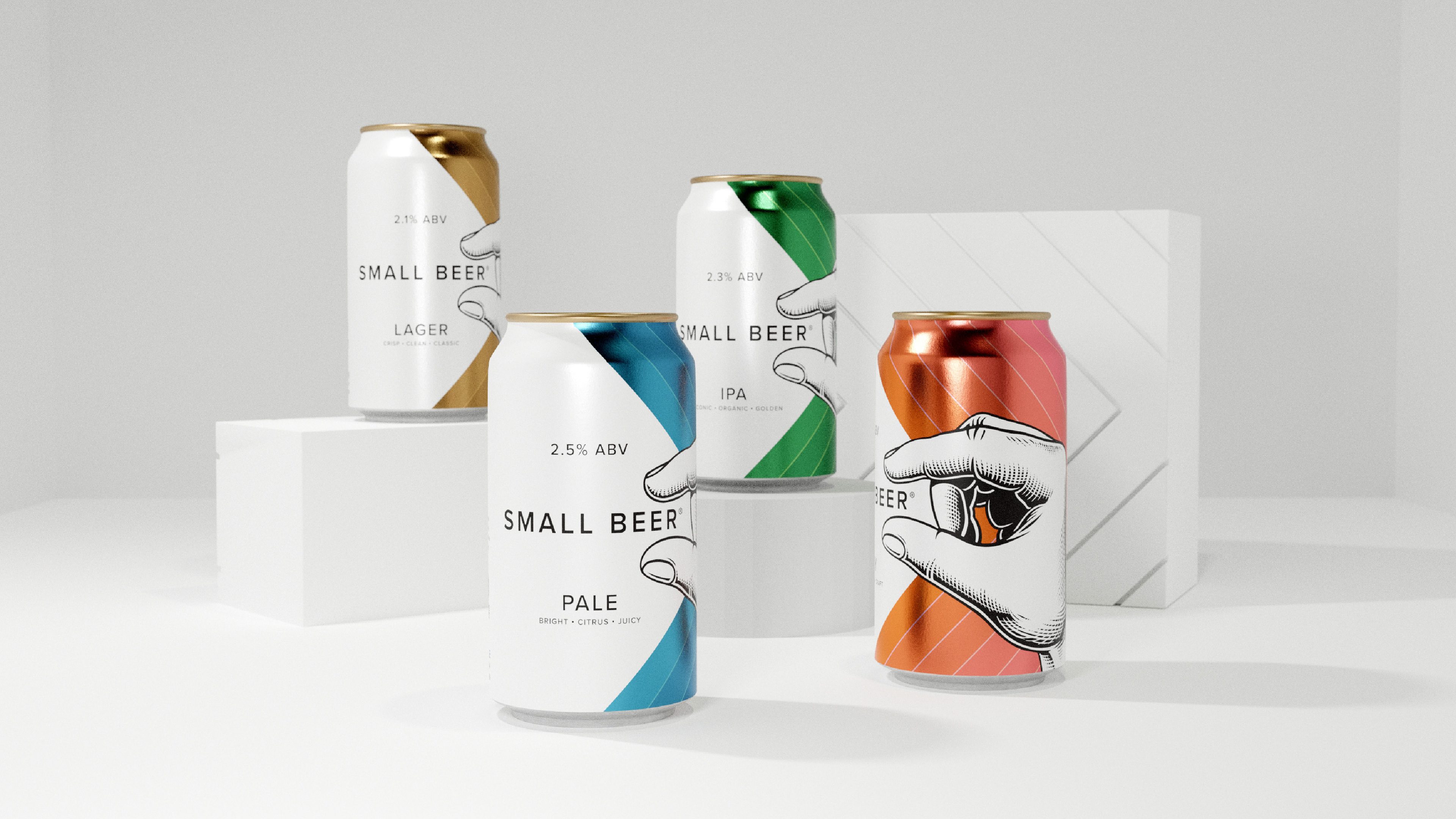
Low ABV beer branding for London’s first B Corp brewery
Small Beer
Future of haircare for Schwarzkopf Professional
SalonLab & Me
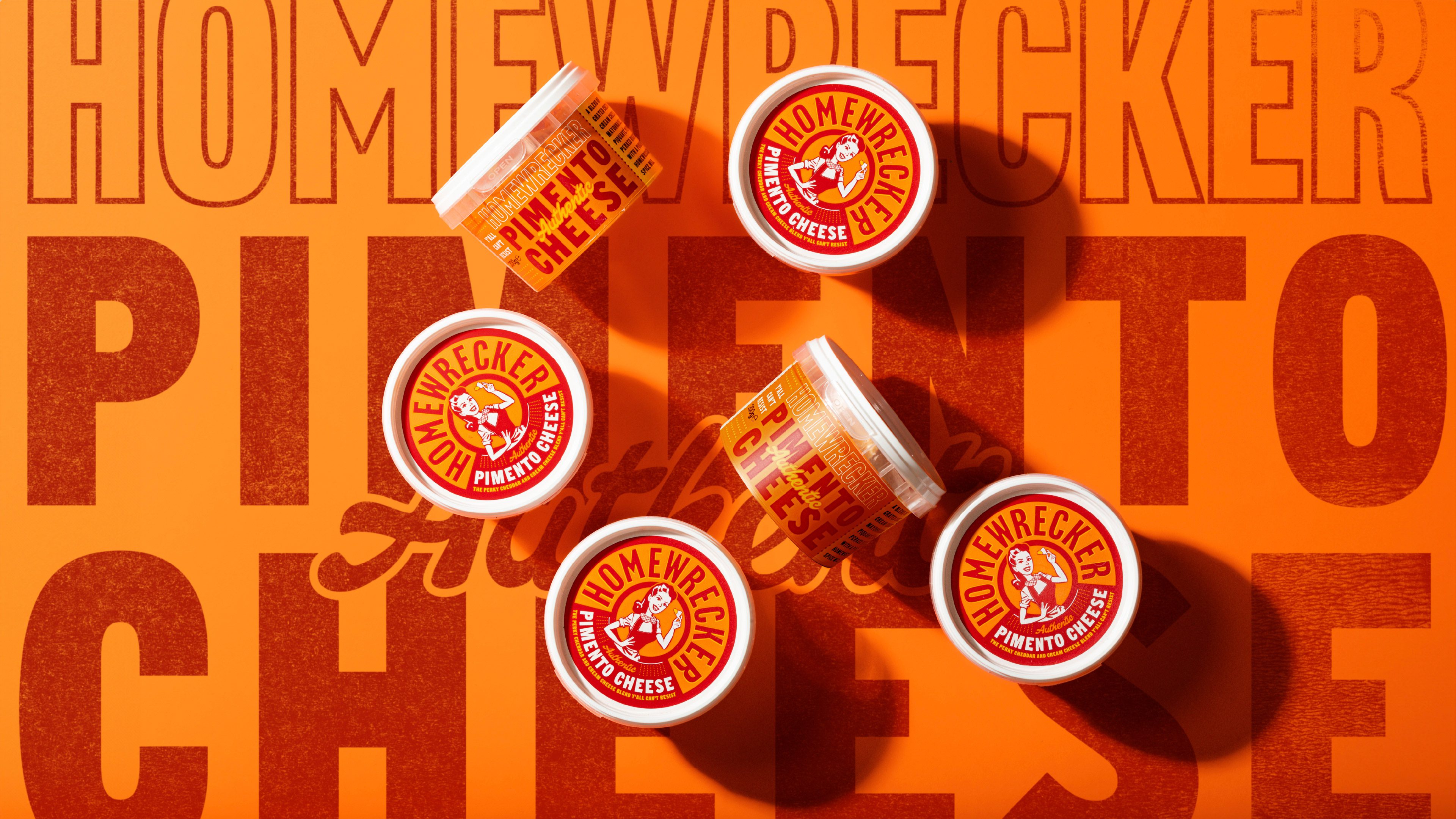
Converting the UK to a Southern Classic
Homewrecker Pimento Cheese
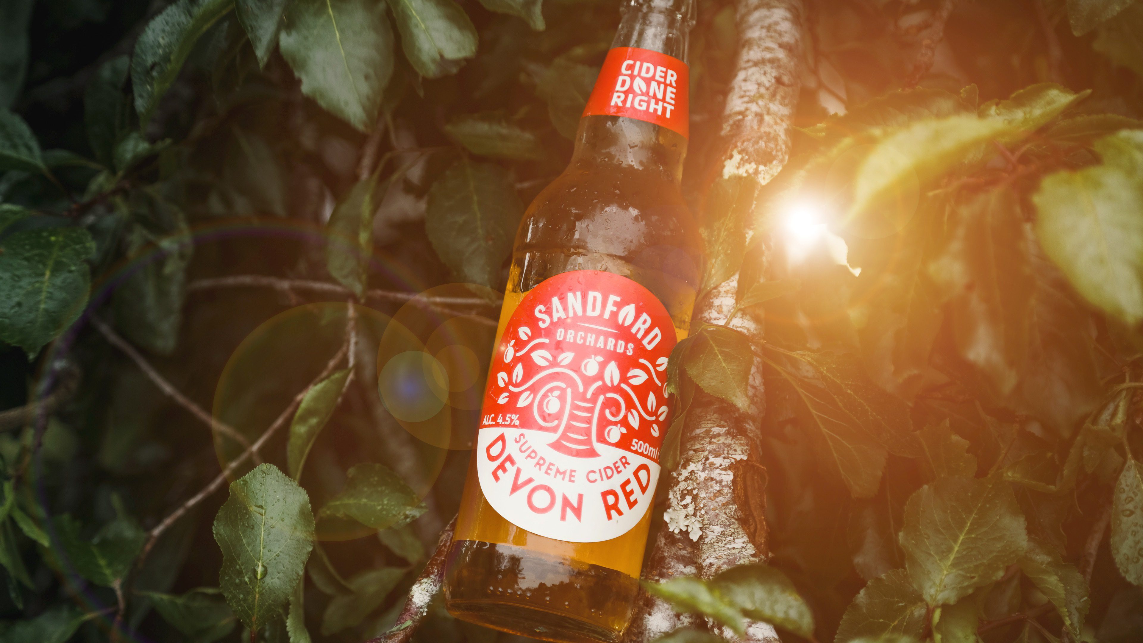
National cider rebrand
Sandford Orchards
Transforming UK’s No.1 Probiotic Brand
Bio-Kult
Awakening a sleeping giant brewery
Renegade Brewery
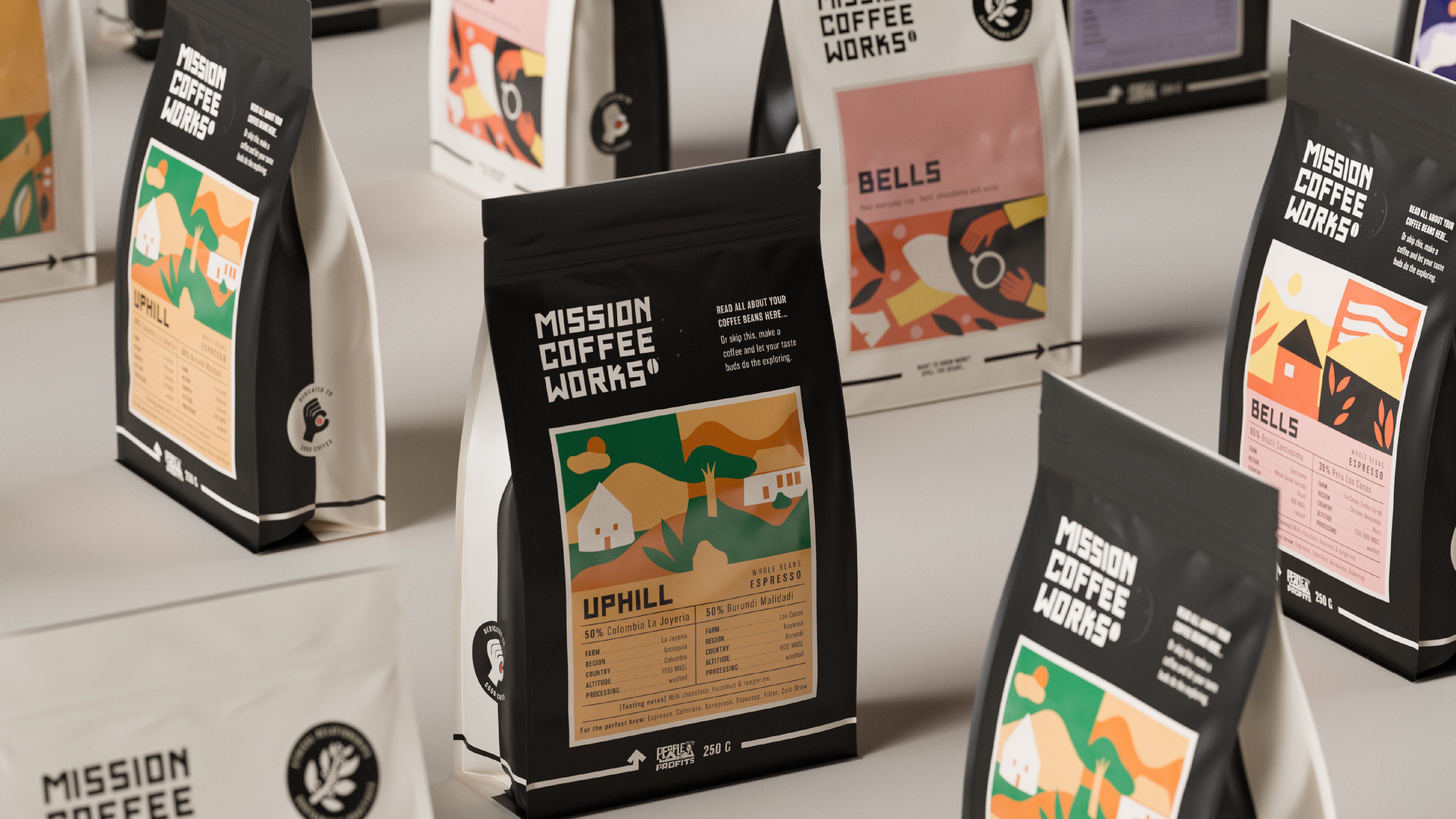
Making specialty coffee for everyone
Mission Coffee Works
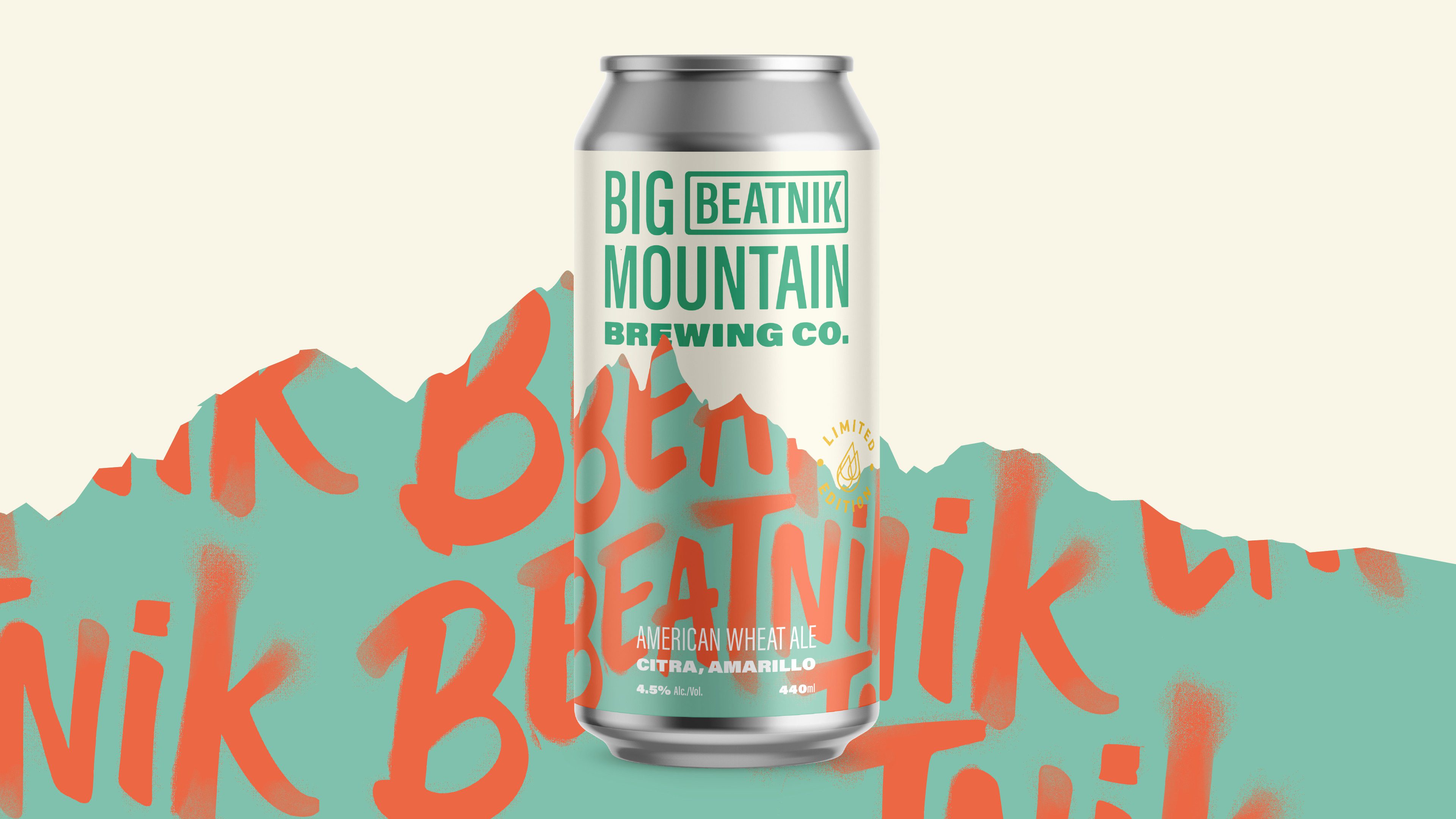
Pioneering craft beer in France
Big Mountain
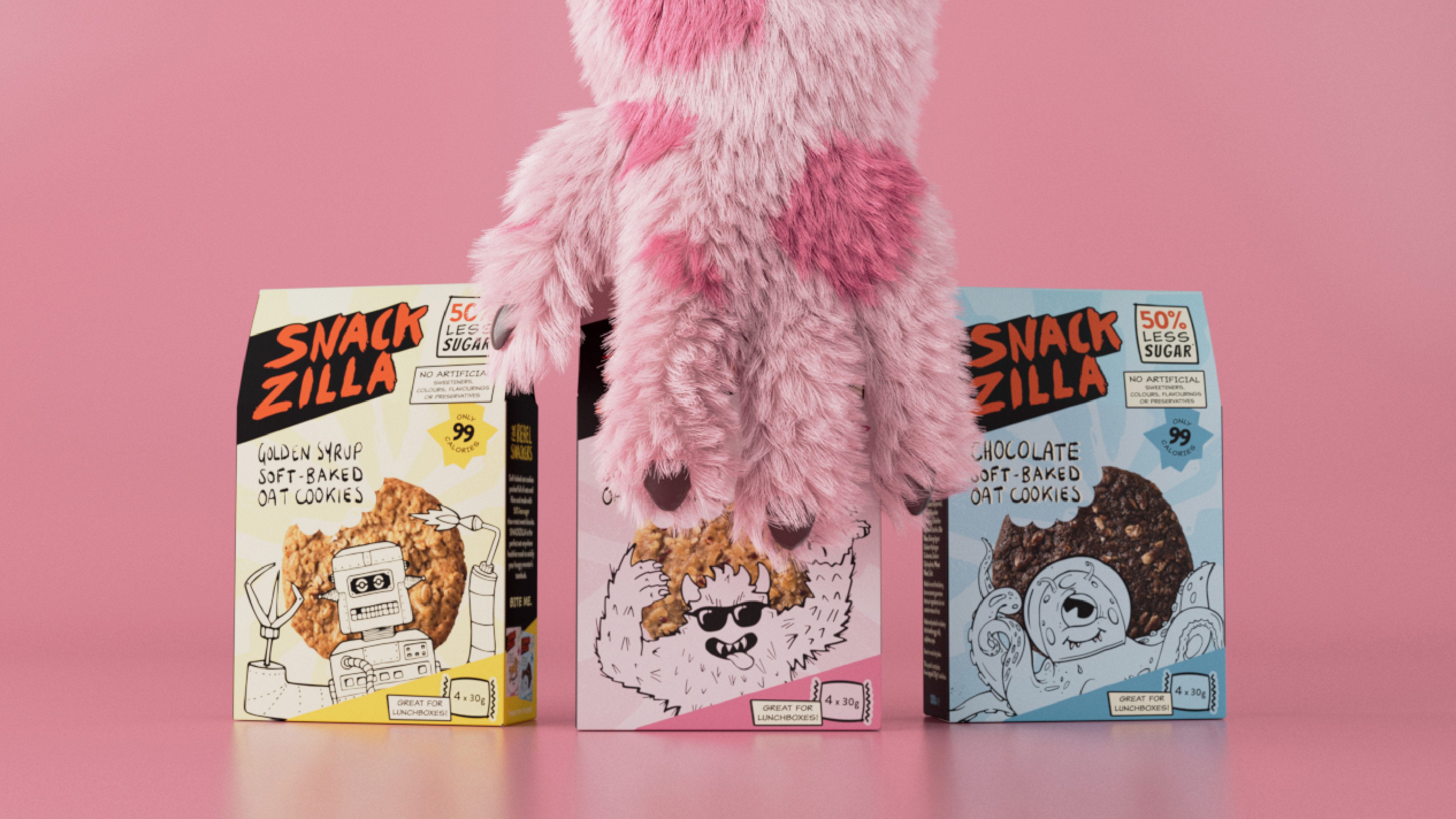
For rebel snackers: At the forefront of kid-friendly snacking
Snackzilla
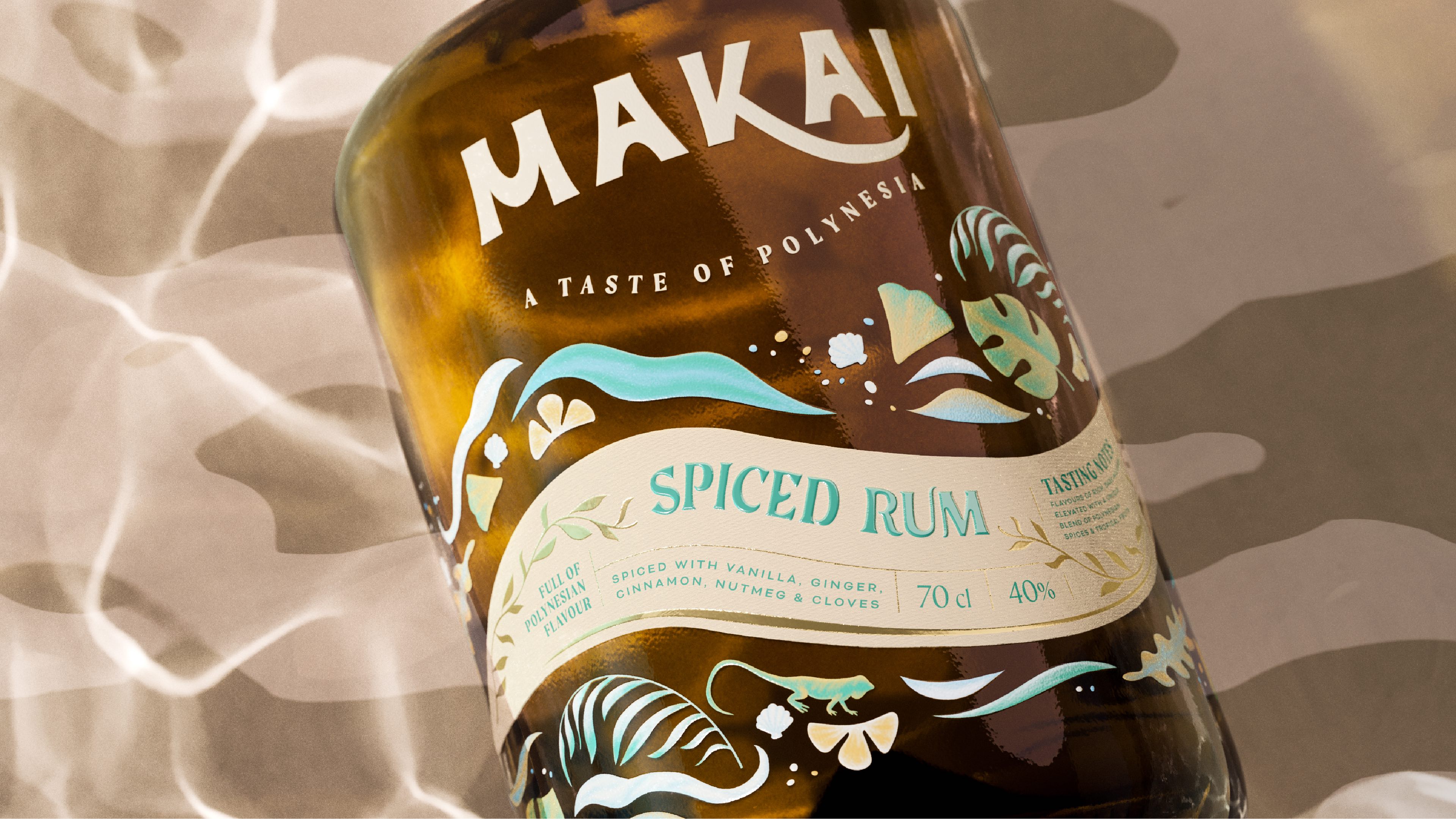
A taste of Polynesia: Where world’s collide
Makai Spiced Rum
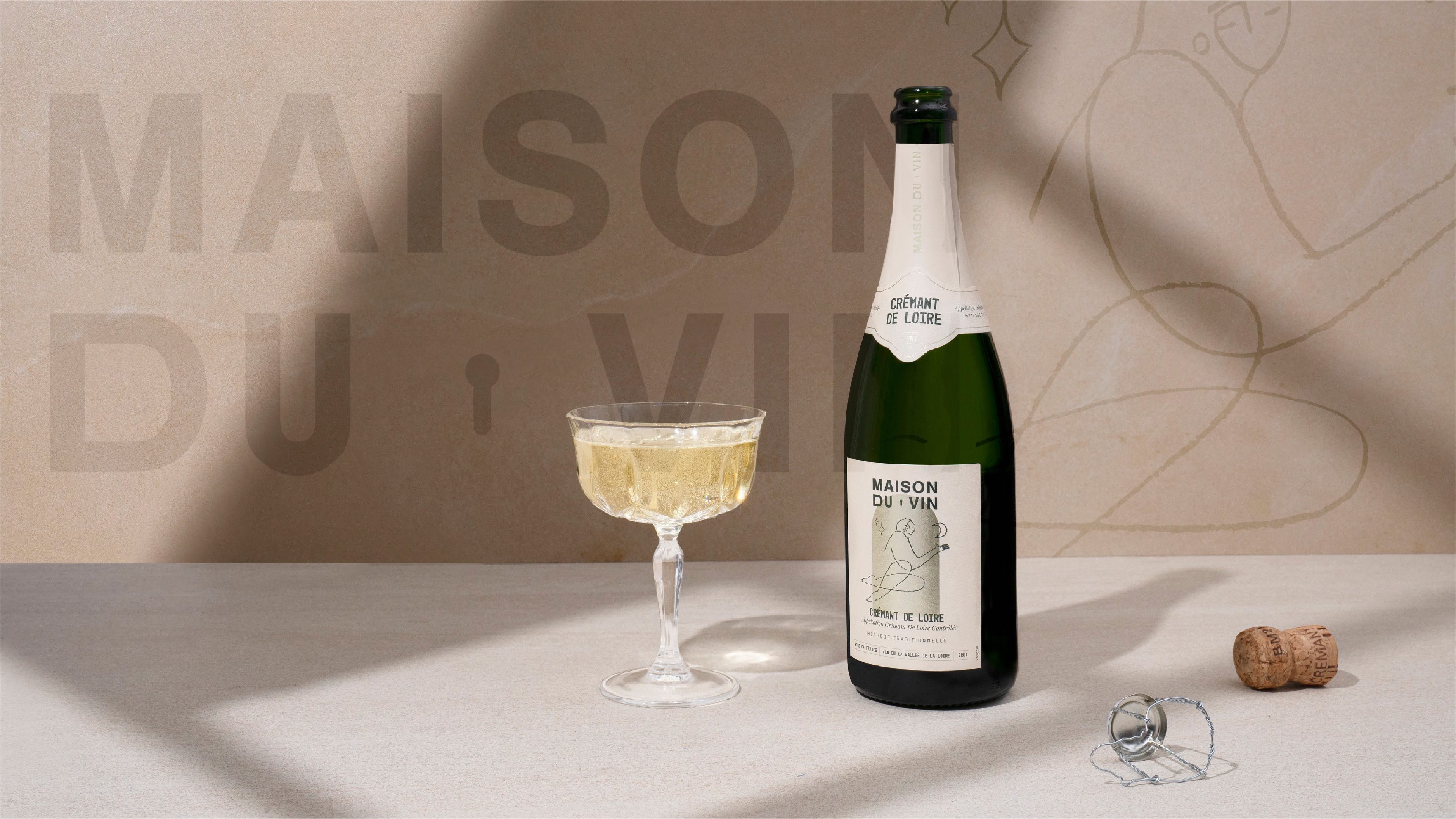
Opening the door to French wine
Maison Du Vin
Cut-through the cocktail clutter
Icely Done
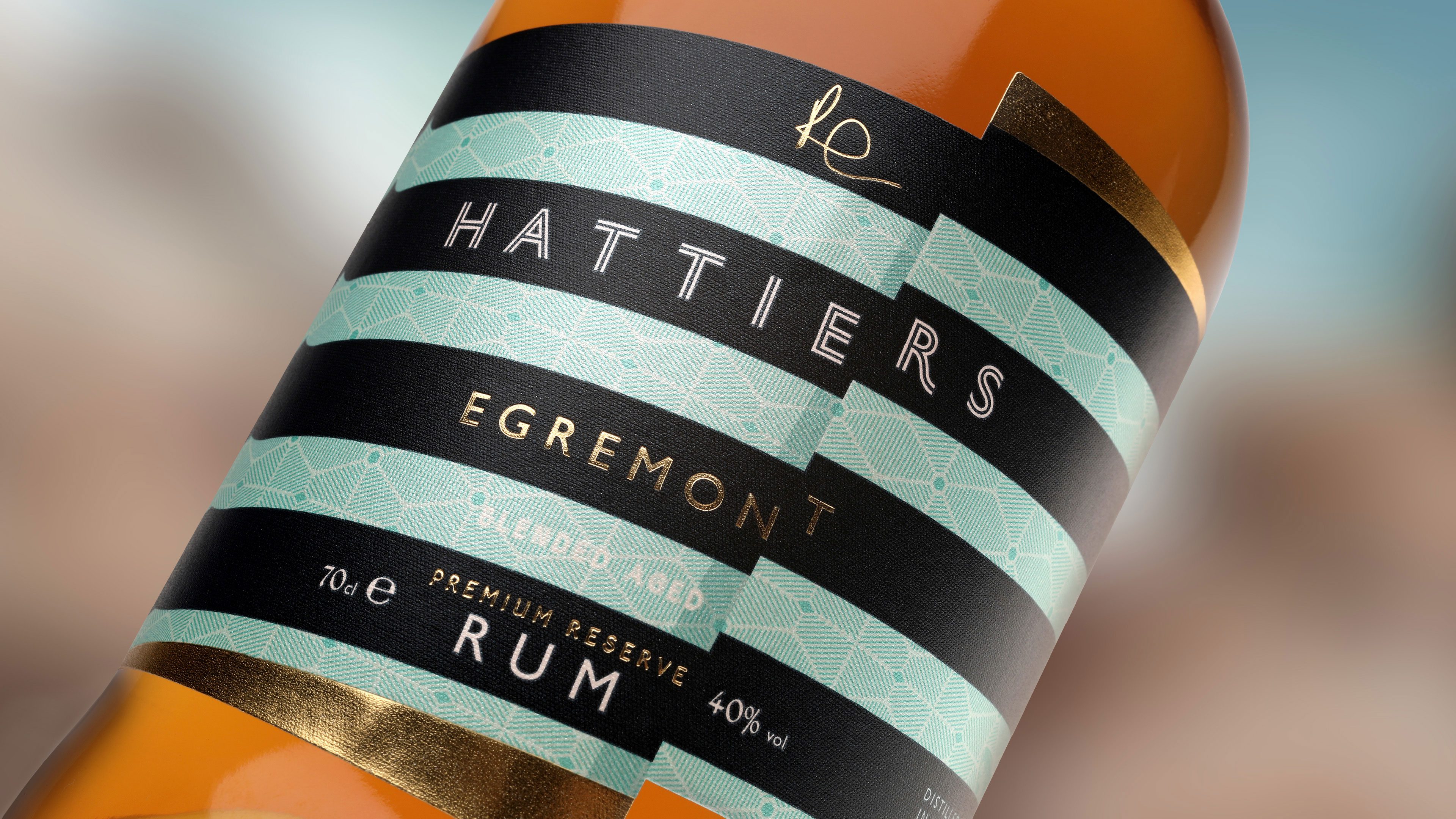
UK’s first B Corp certified rum
Hattiers Rum
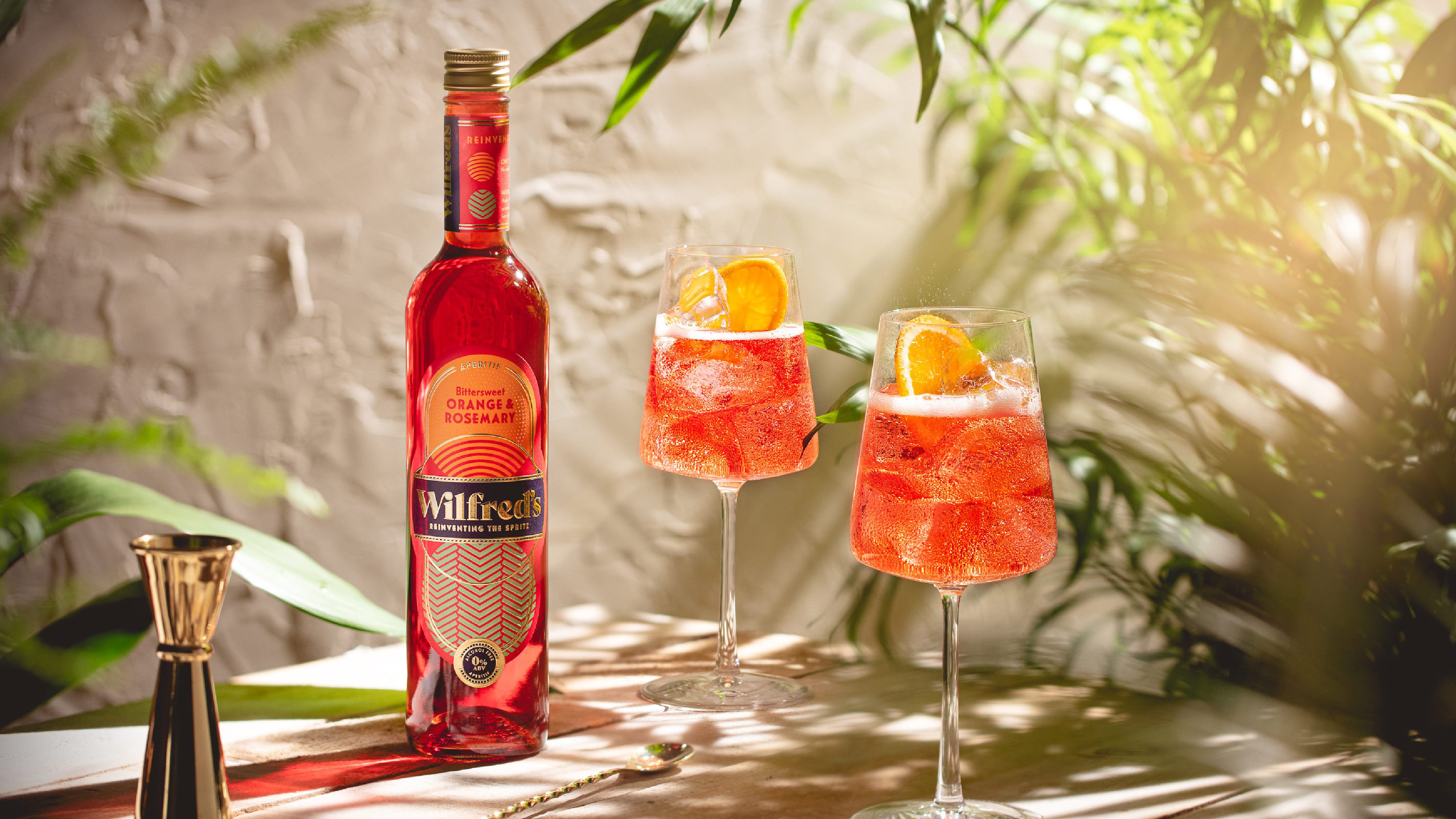
Luxury non-alcoholic aperitif branding
Wilfred’s
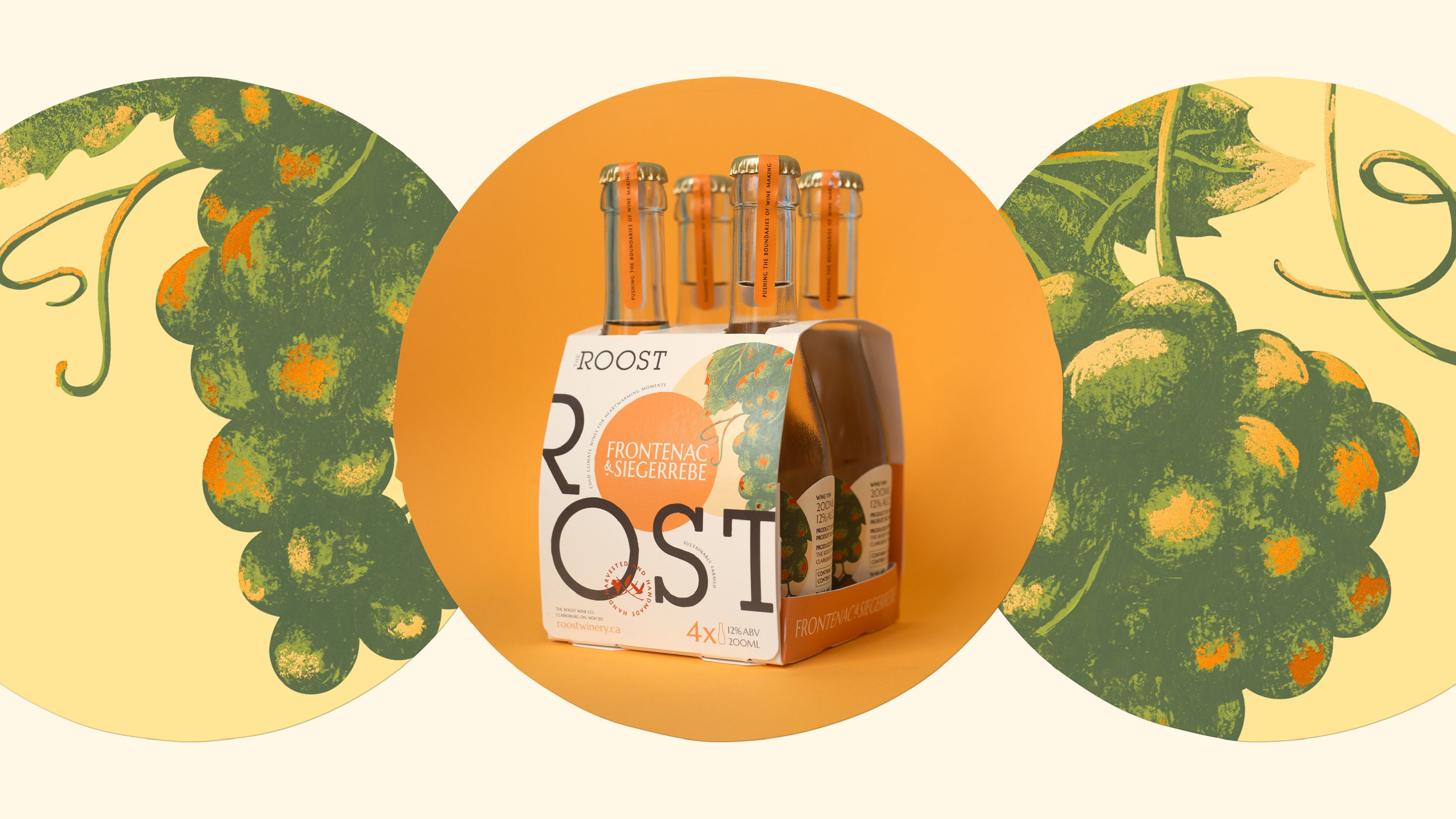
Creating a brand for new wine-drinking occasions
The Roost
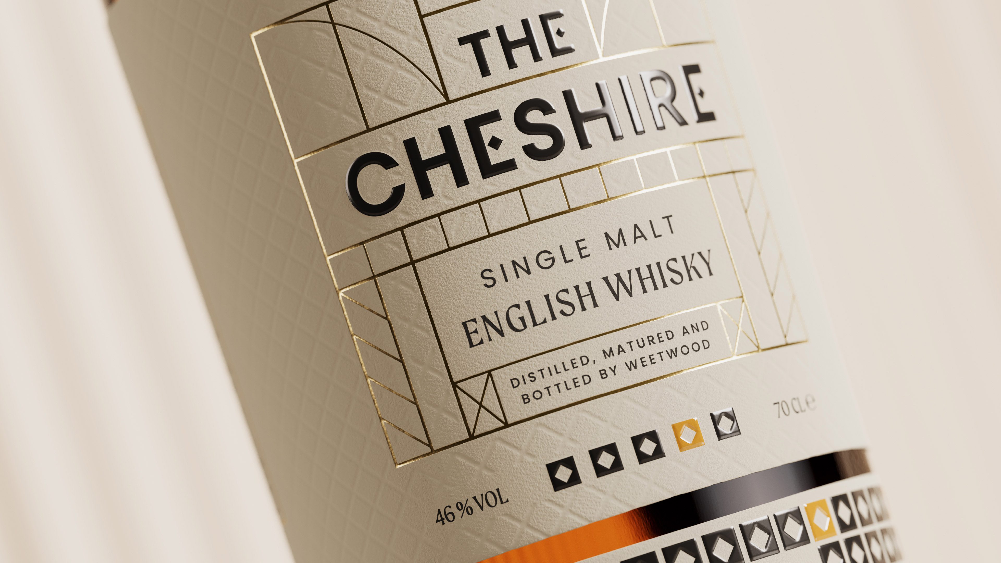
Single Malt Whisky from England
The Cheshire
A new era of mixers in India: Refreshing Svami
Svami
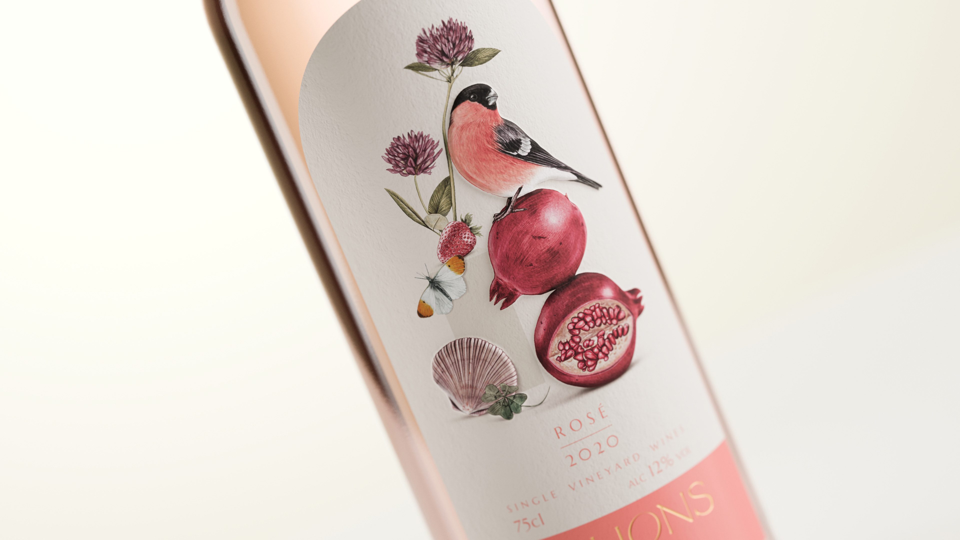
Untraditional boutique English wine branding
Dillions Vineyard
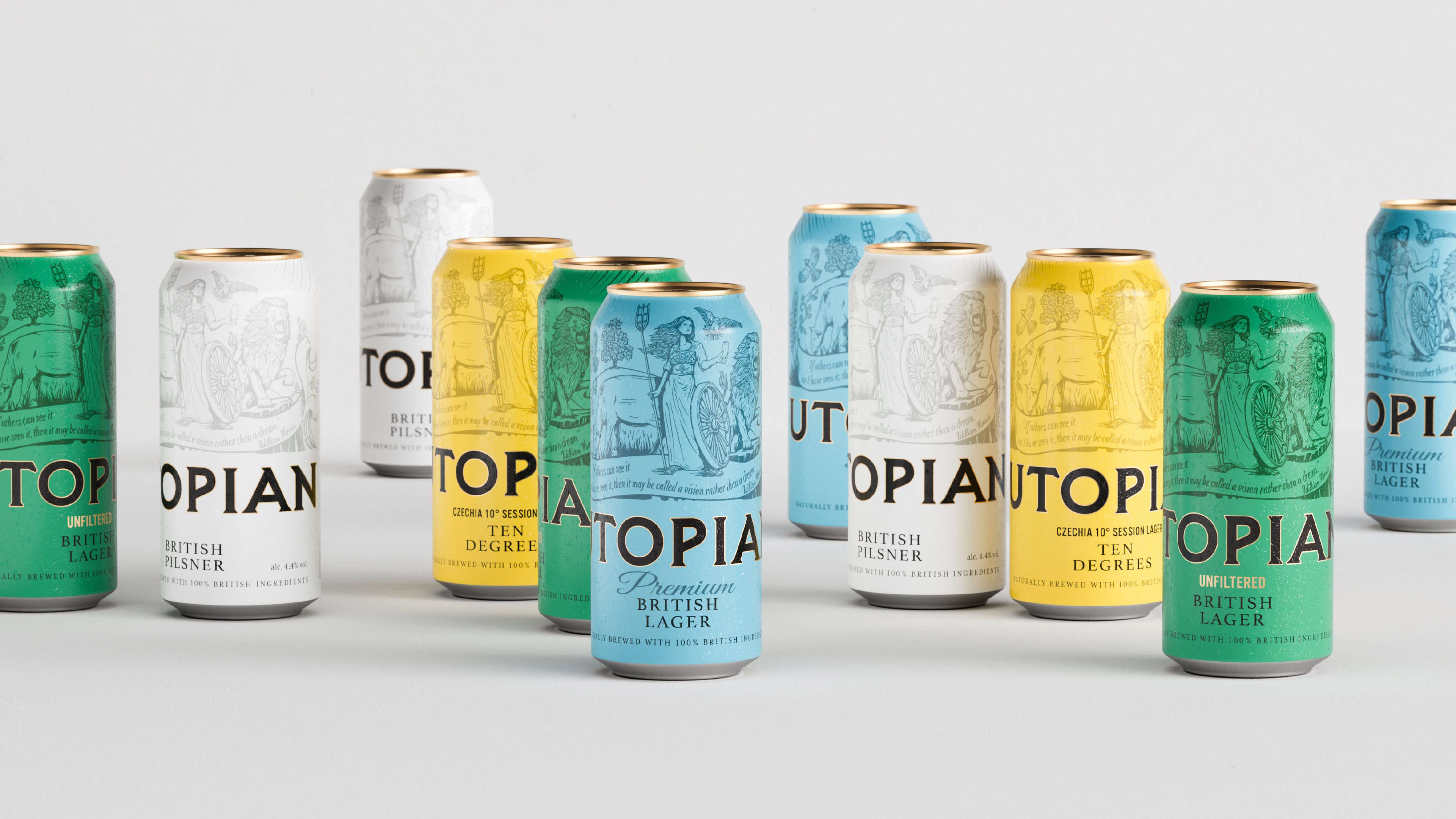
The British lager with sustainability at its core
Utopian Brewing
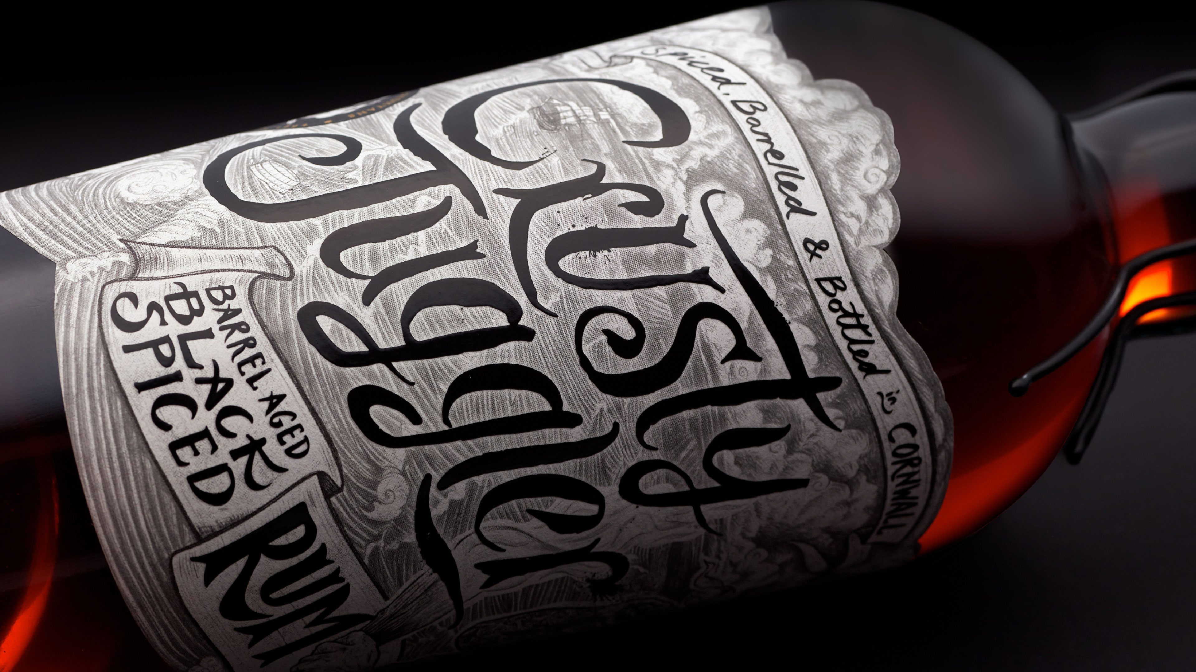
Adventurous black spiced rum branding
Crusty Juggler
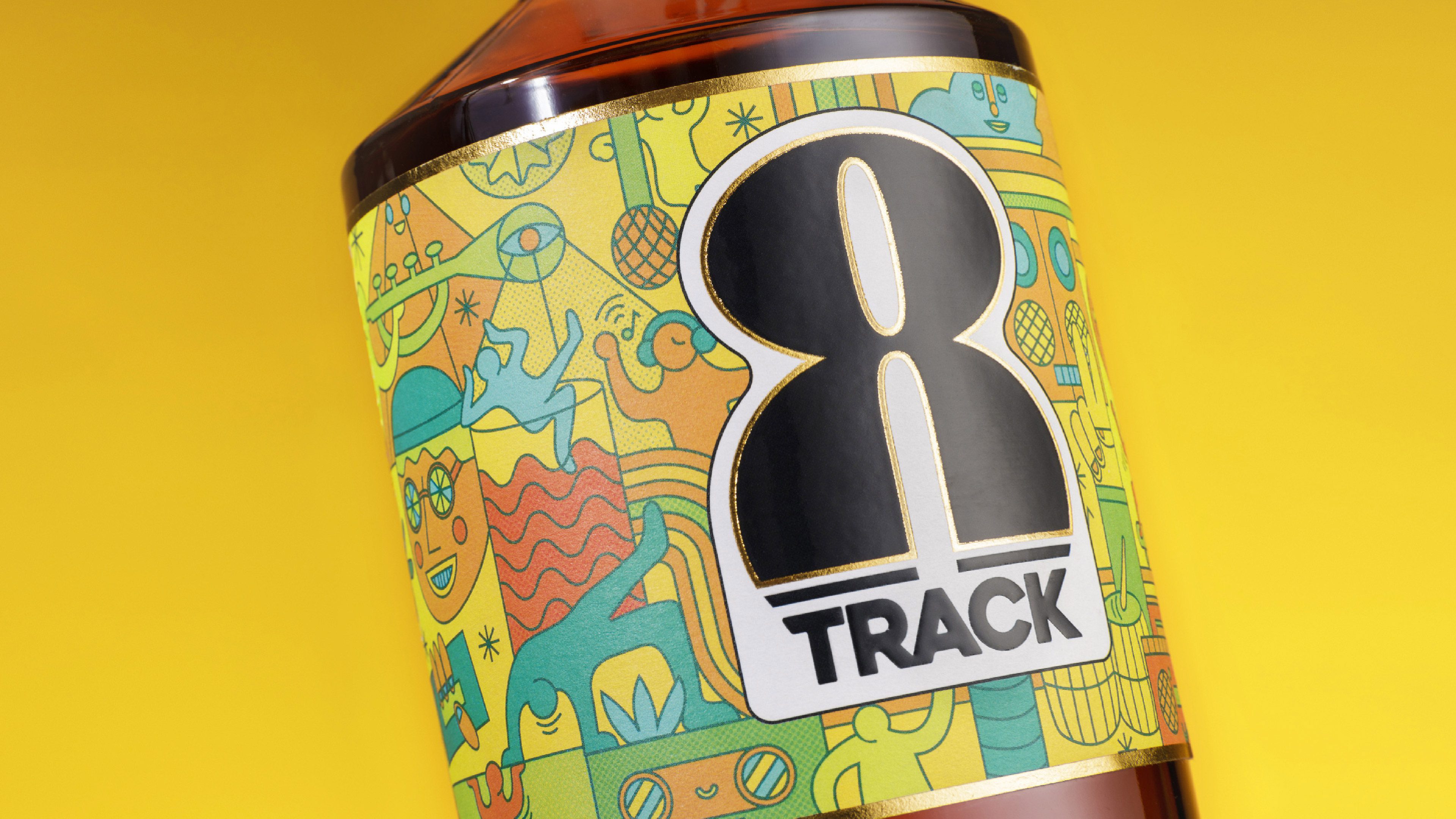
a feel-good rum brand for feel-good times!
8Track Rum
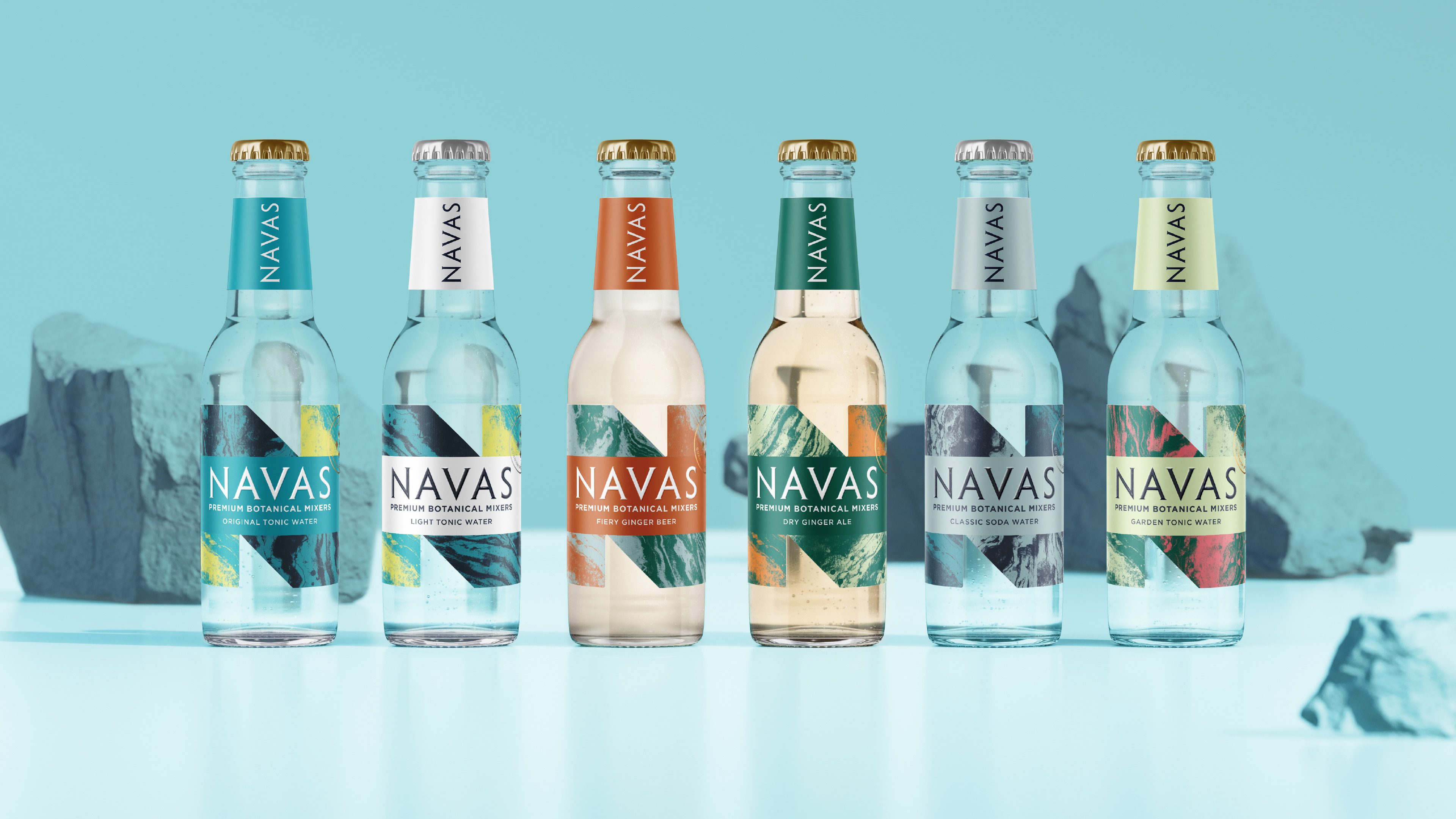
A natural pairing for premium spirits
Navas
Reconnecting with tea from trees
From Trees
Making sustainable choices simple and joyful
Bottlecup
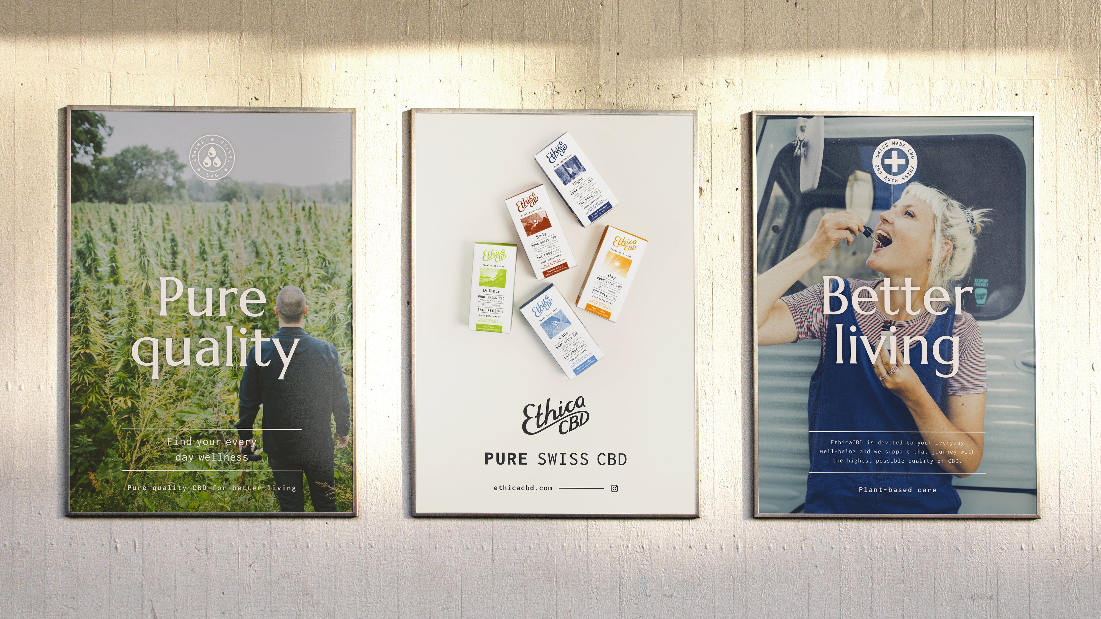
Creating plant-based care with ethical CBD
Ethica CBD
Plastic-free, vegan skincare branding
Scence
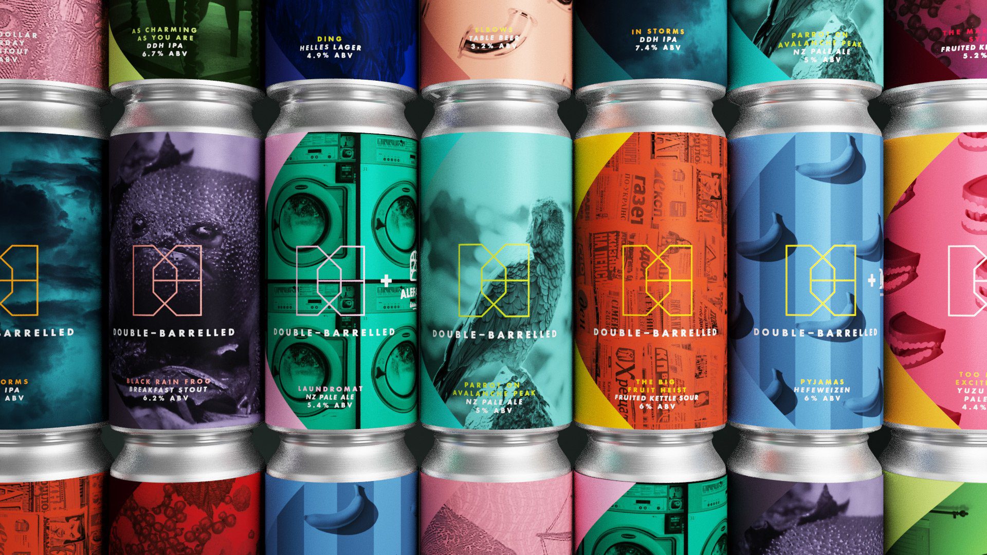
Journeys into craft beer
Double-Barrelled
Indian oat milk branding for millennials
AltCo.
Making Waves with young people in Cornwall
Young People Cornwall
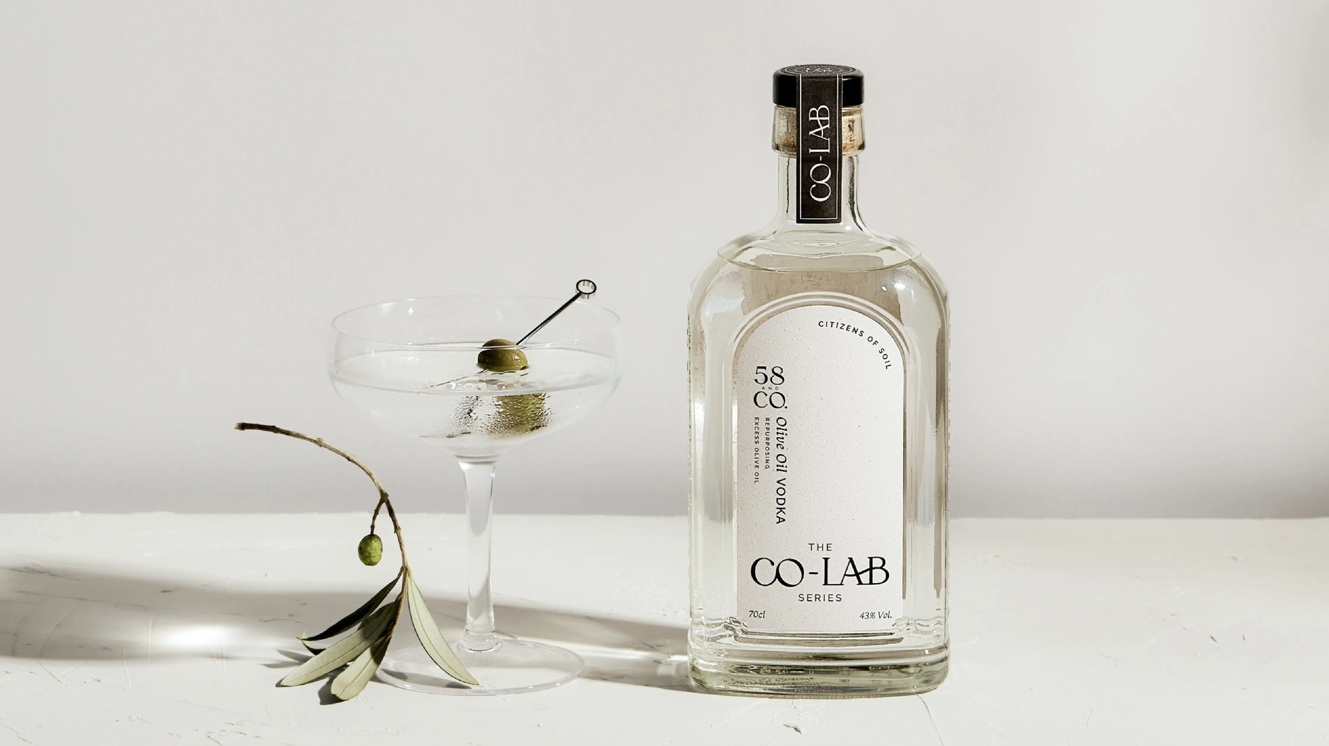
A brand extension that celebrates sustainable choices
58 and Co. Co-Lab Series
Solving the Diaper problem
Pika Diapers
talk to our team
©2022 Kingdom & Sparrow Ltd.
Powered by Green Hosting