Think Big, Drink Small
IDENTITY REFINEMENT | ILLUSTRATION | BRAND MANIFESTO | TONE OF VOICE | PACKAGING | STYLE GUIDE

The Concept
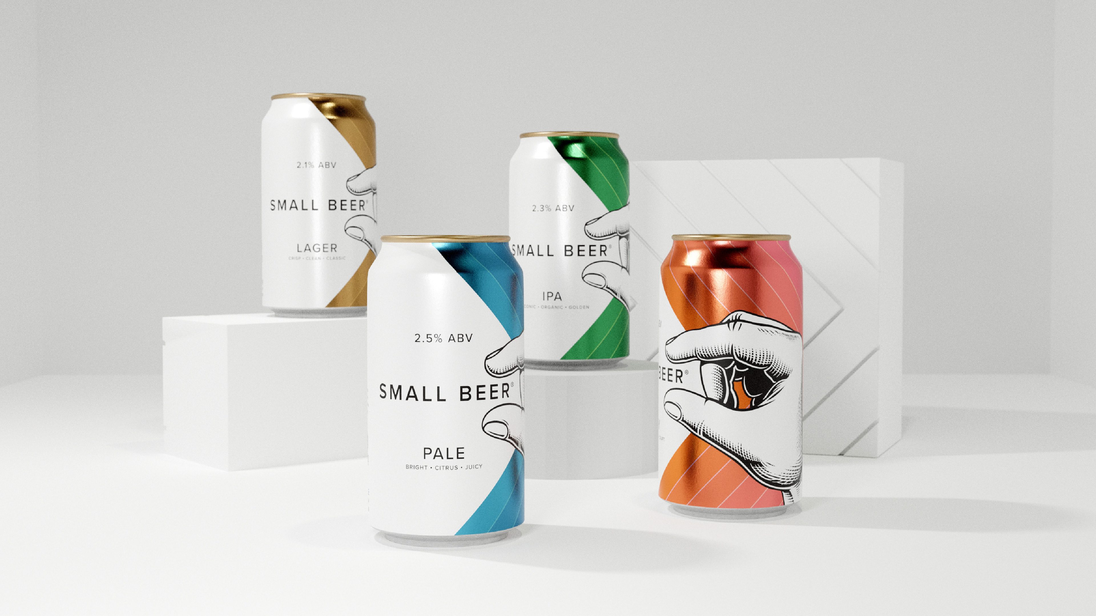
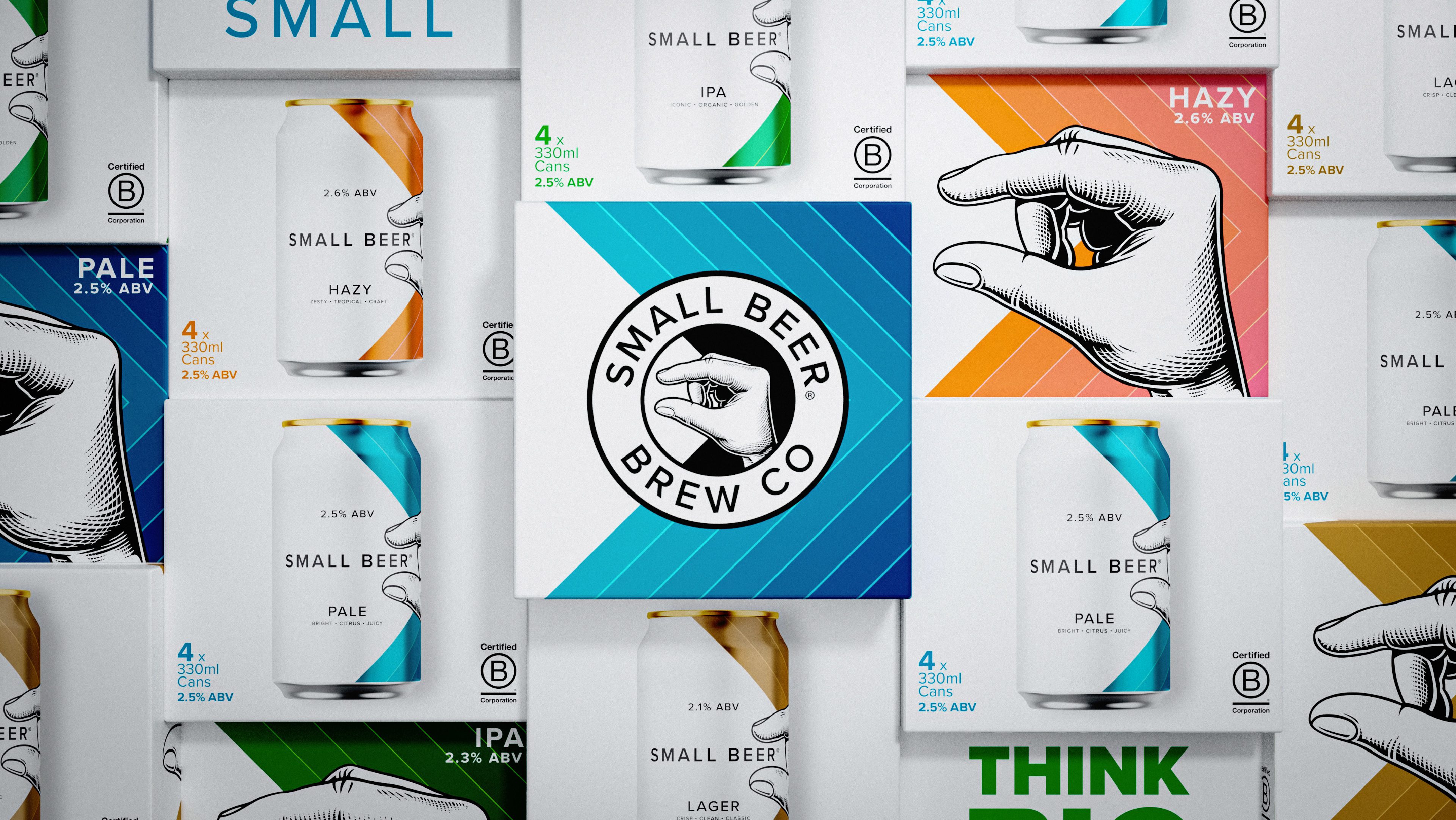
We established Small Beer’s brand when they first launched, delivering delicious, high quality beers at sociable ABVs of under 3%. The brand identity and packaging design won First Place at the 2019 Dieline Awards and Gold at the World Brand Design Society Awards, and Small Beer has since gone from strength to strength.
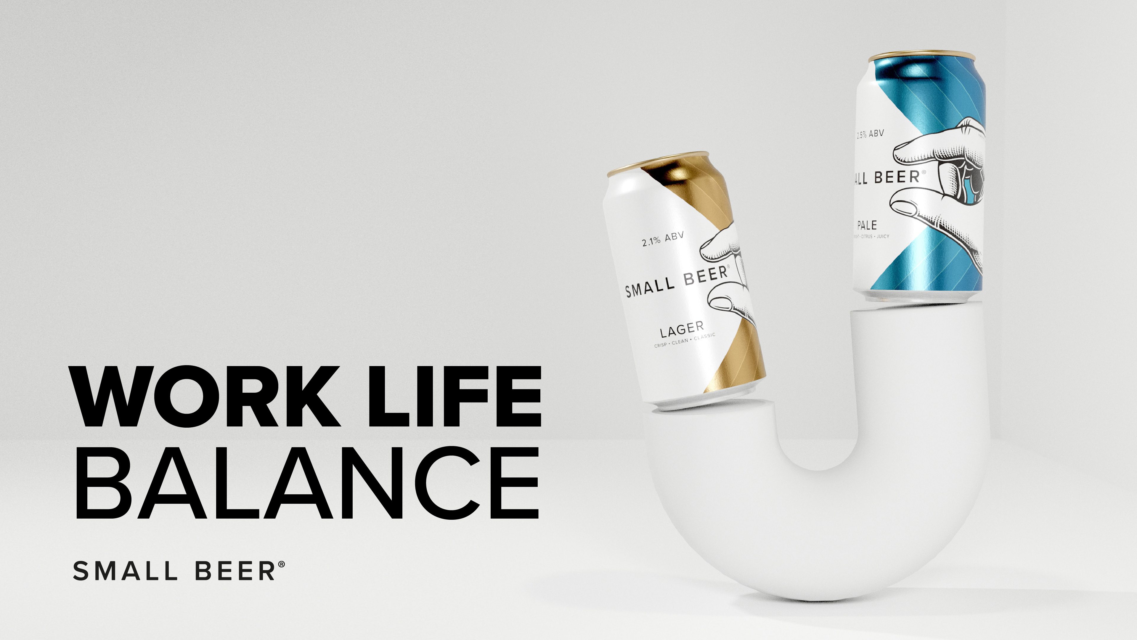
For this refresh, we developed the Small Beer proposition and brand assets to bolster the meaning and recognisability of the brand in people’s lives. Whatever self you need to be, make it your best one.
The Impact
A consistent, clear brand with a strong, future-forward proposition and assets to carry Small Beer into the future.
Our recent refresh updates the brand visuals to better reach their audience and communicate their refined proposition. As the low ABV beverage category – especially low ABV beers – grows exponentially, Small Beer can continue to lead and define their category.
Positive Change
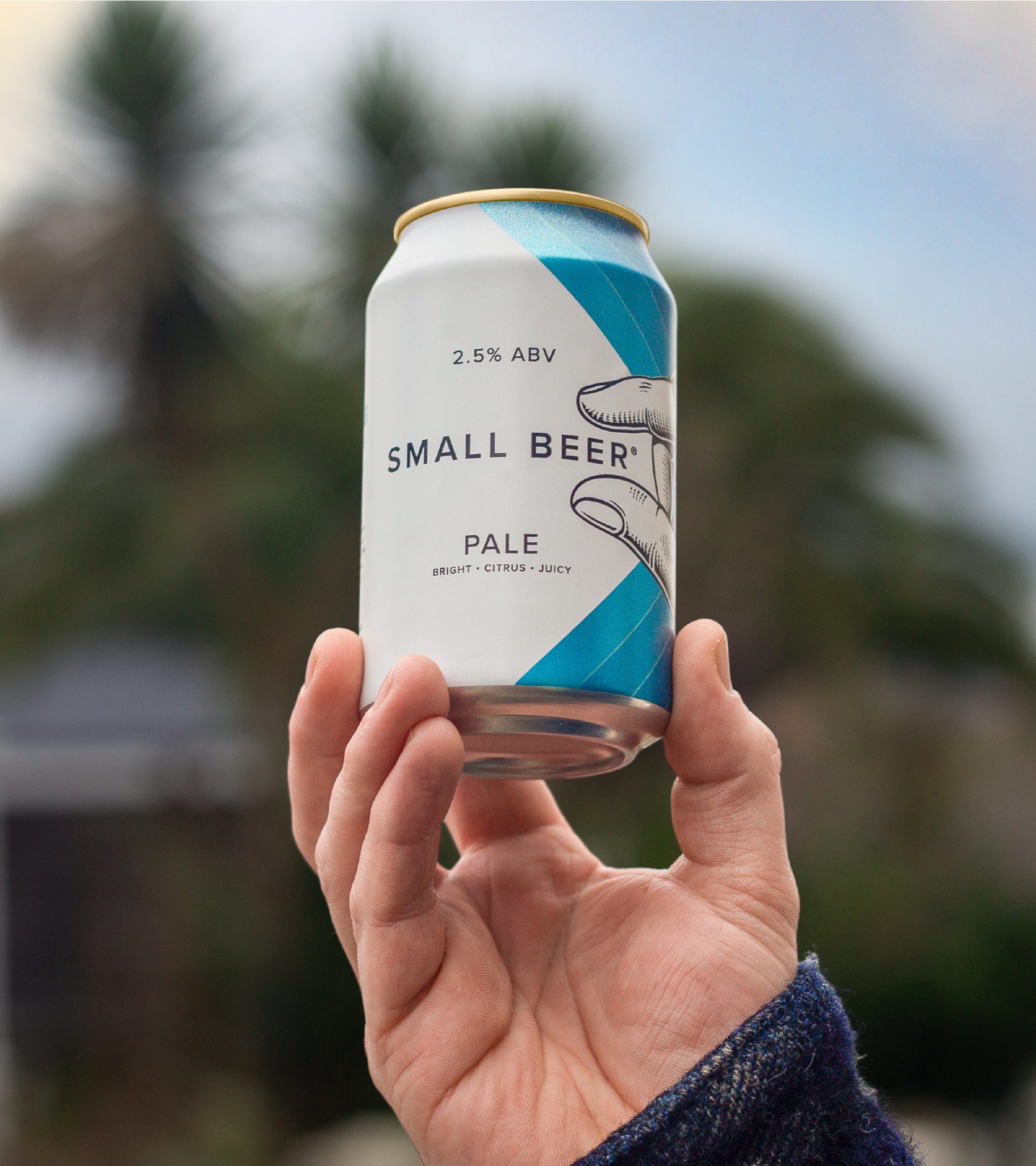
The first B-Corp brewery in London, Small Beer brings sustainably brewed, sociable beer to the masses. Small Beer ensures you can make the most of every day; be productive, be inventive, be playful, be creative, be inspiring, be present and enjoy great beer.
We looked at ways to bring consistency of brand messaging, brand assets and range structure across consumer touchpoints to ensure Small Beer is front-of-mind for their key target audience.
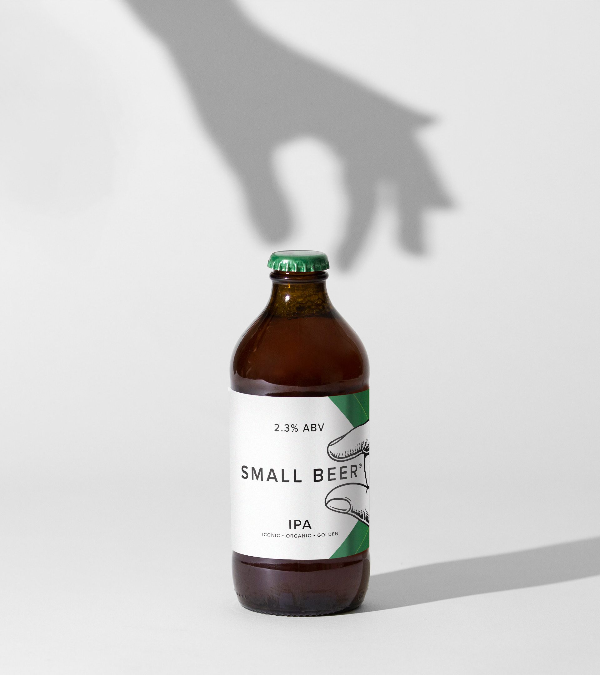
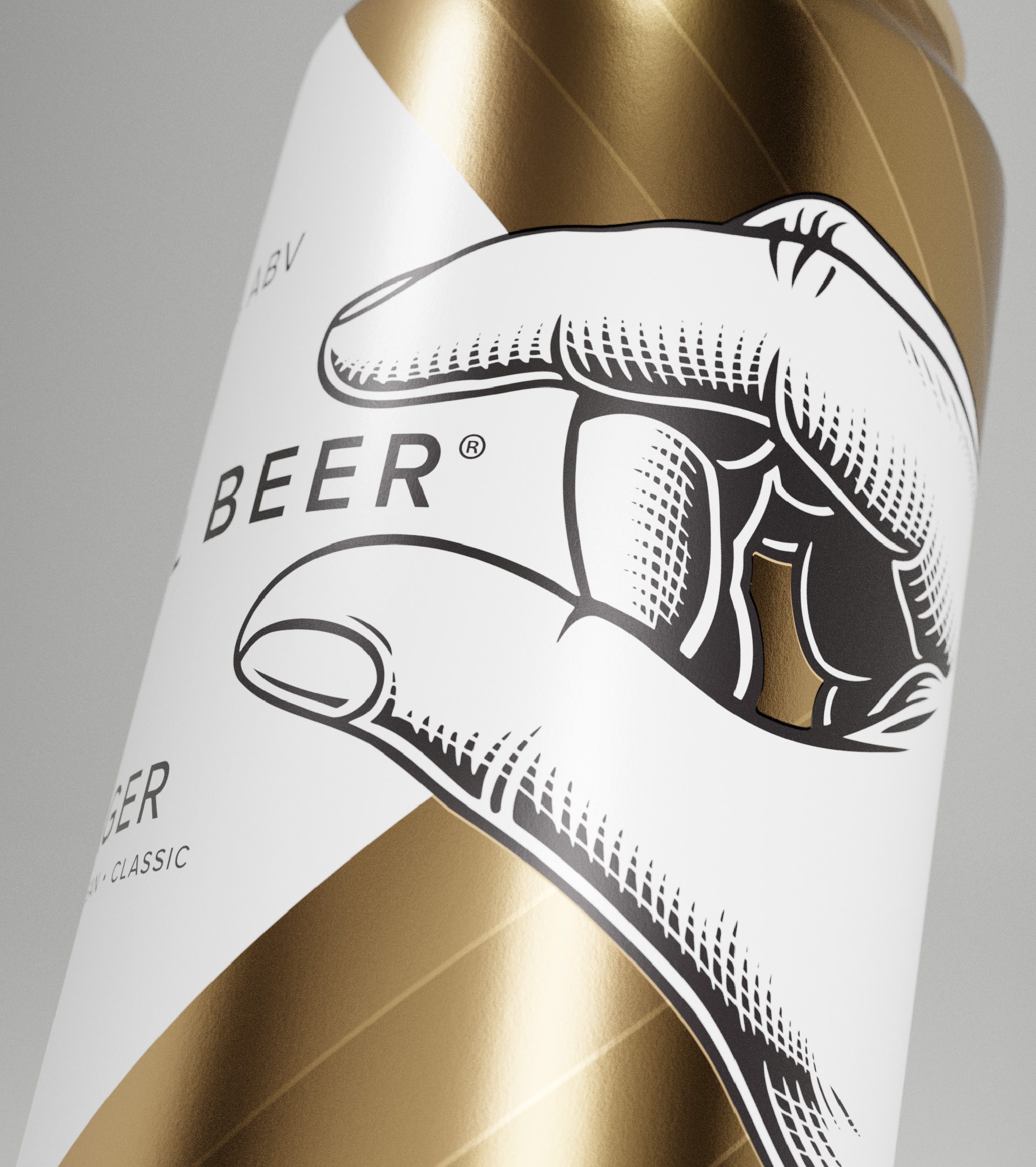
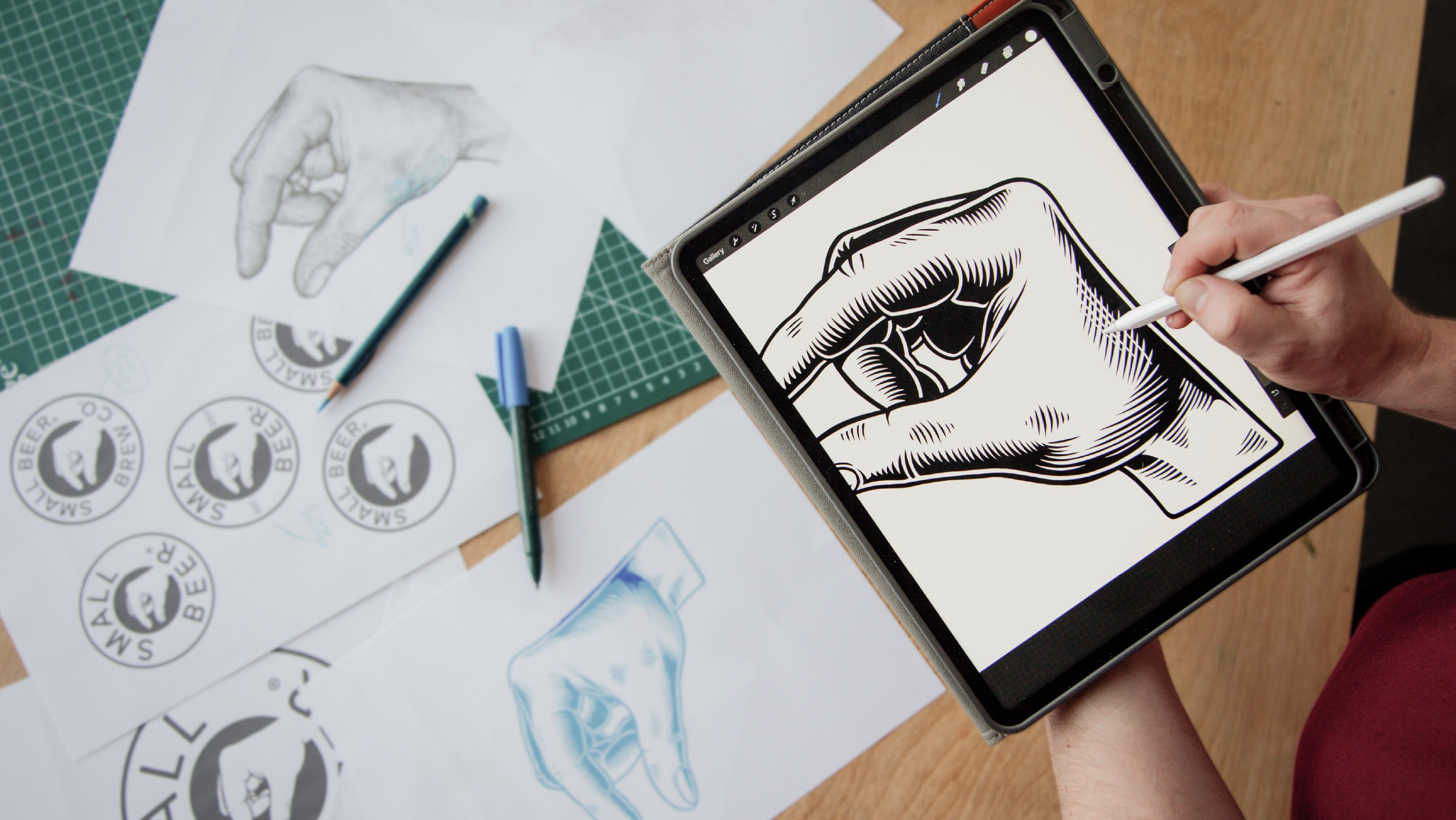
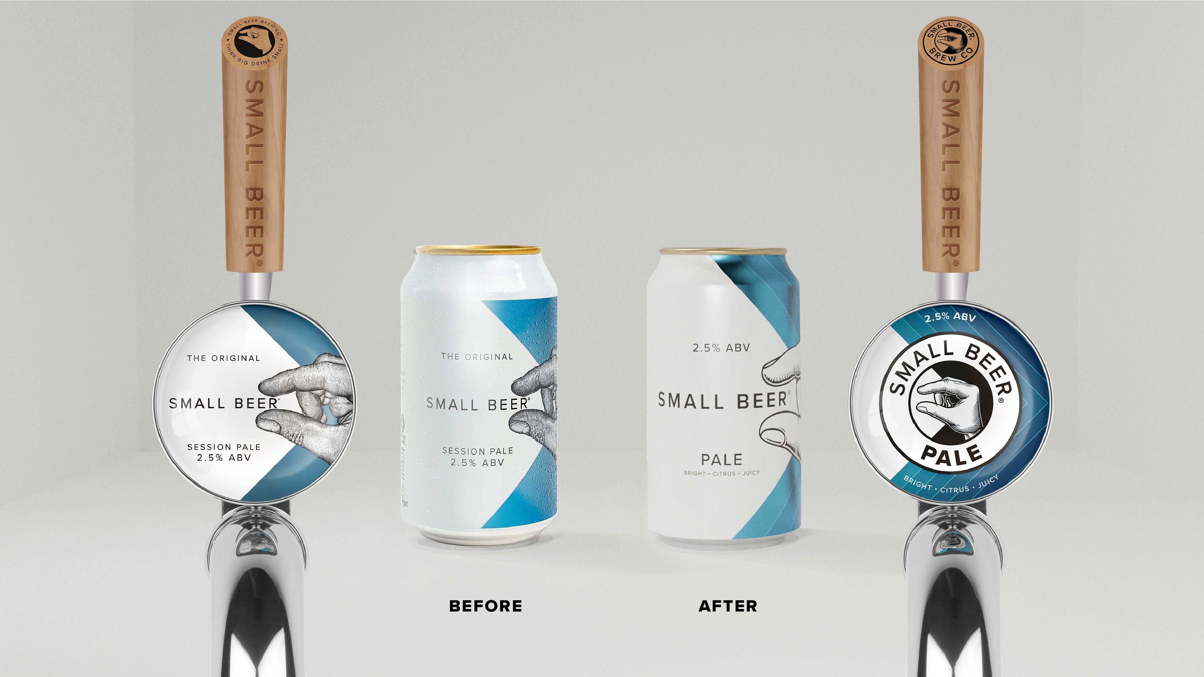
We relooked at the illustrative hand to bring it in line across all touchpoints – from can to keg lens. The new hand is a move forward that feels more fresh and clean, and makes for a clearer, consistent brand asset that can be used in more places.
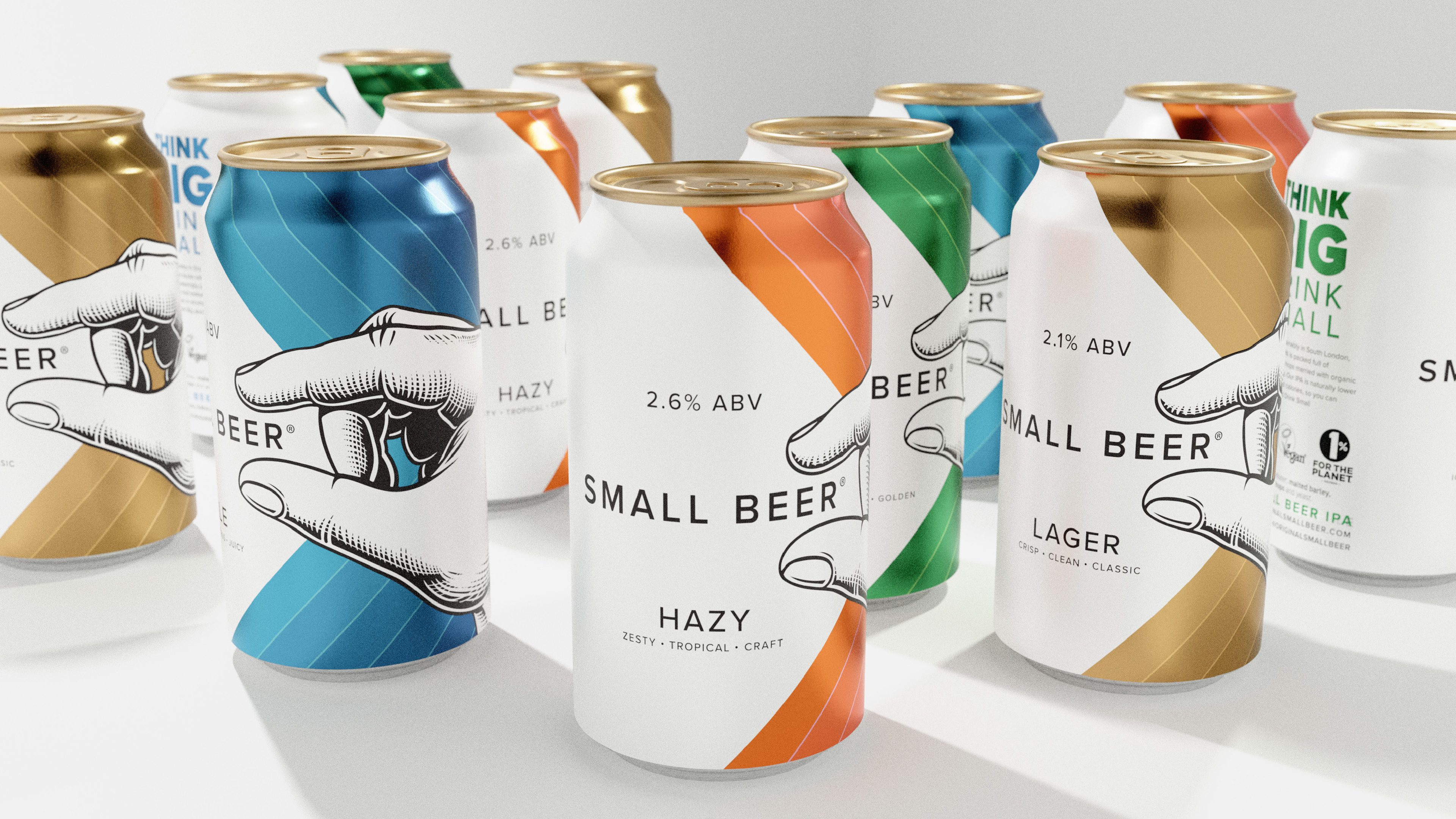
We also used this new hand to explore more consistent logo lockups with the logo typography, to keep the assets front of mind at all times. We reinforced the chevron assets across the colours and brightened up the colours themselves to increase shelf and bar stand-out, and differentiation.