


Explore More Work
-
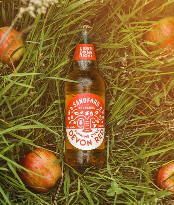
Sandford Orchards Cider
A fresh cider rebrand for Sandford Orchards. We gave this Devon orchard some bold new can and bottle label designs to match their great tasting cider.
-
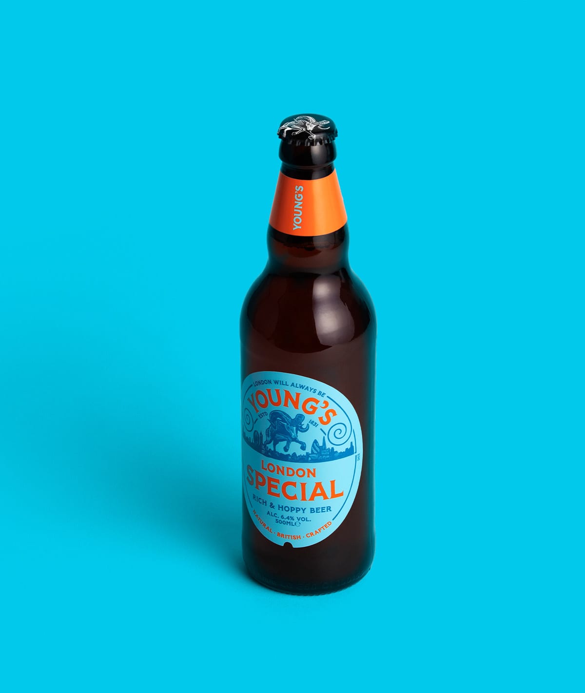
Young’s
Cask ale rammed with attitude: a progressive repositioning for a heritage brewery.
-
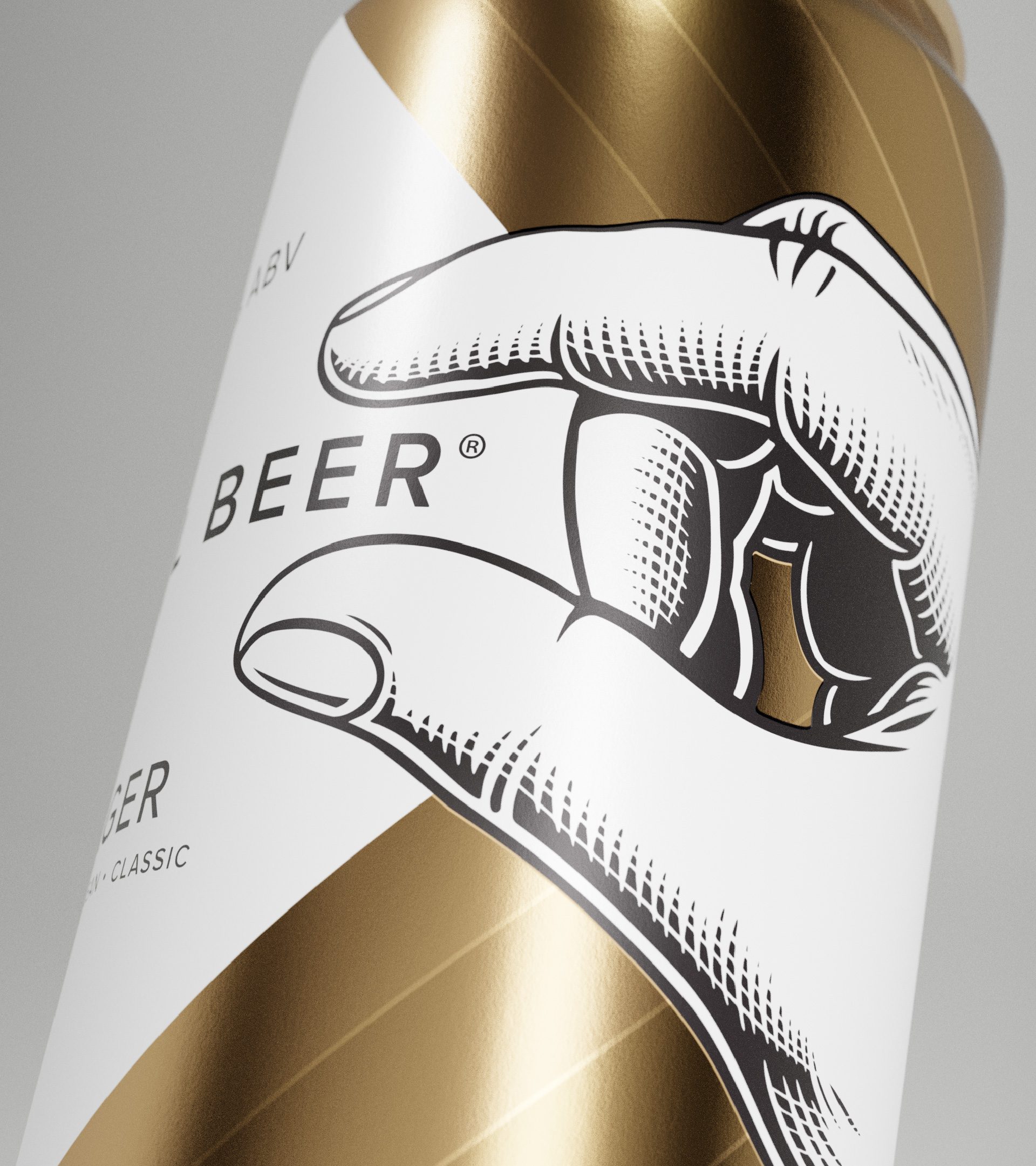
Small Beer
Award-winning beer branding for sustainable brewery, Small Beer. Since branding Small Beer, the packaging design has won awards and been picked up by multiple national retailers!


