What is type and typography?
Type refers to pre-fabricated, replicable lettershapes. Typefaces are families of these lettershapes that share characteristics – like DNA – and work together as one.
Typography is how we use type (e.g. size, weight, colour and position).
Why is it important?
The ideas and values behind every brand are seldom expressed alone without messaging – without words.
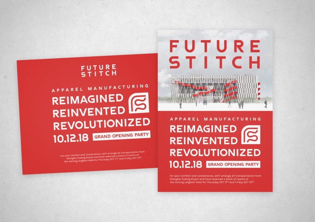
Type and typography is one way in which we create a visual tone of voice – connecting these ideas and brand values to messaging.
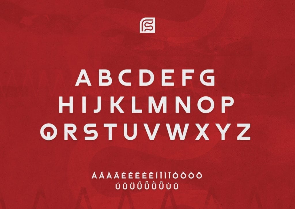
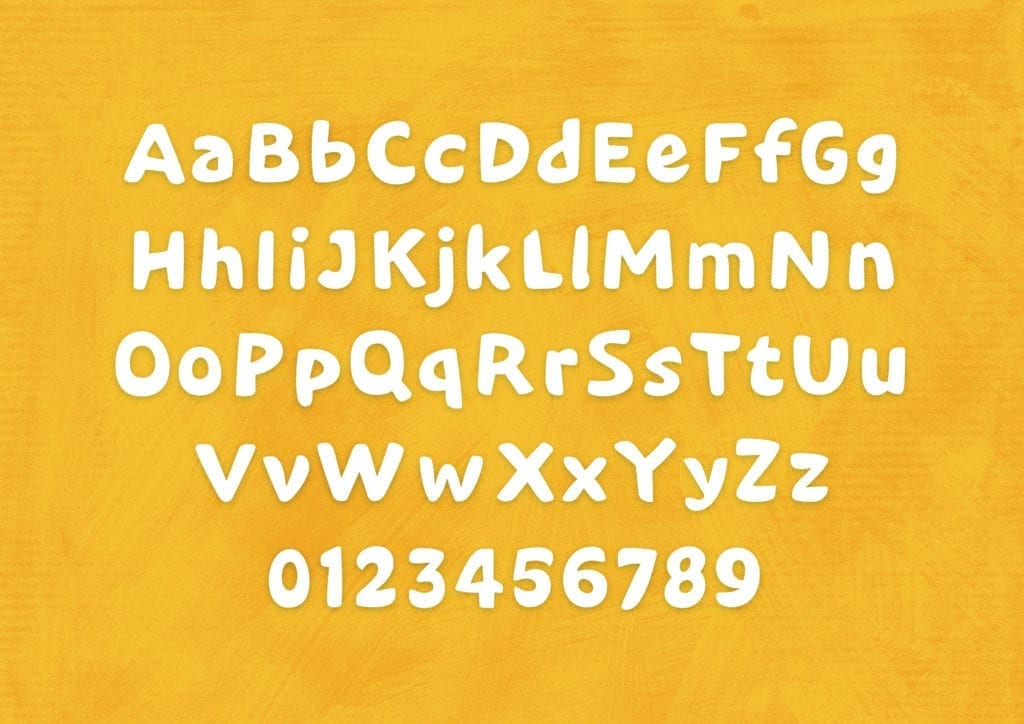
The characteristics of letter shapes evoke a response within us; curvy shapes tilted inconsistently, used with scatty placement and bright colours gives a sense of playful light-heartedness.
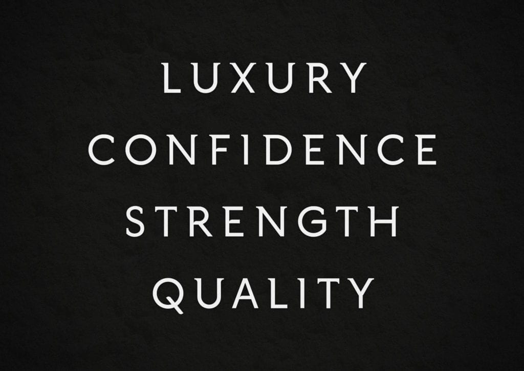
Conversely, a strict axis with sharper characteristics, positioned crisply create a more grown-up, confident and serious tone.
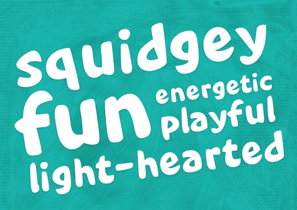
How do we do it?
From the very beginning of the branding process we define a creative strategy that gets to the core of what a brand’s tone and messaging needs to be.
We call on our historical, theoretical and practical knowledge to make concise decisions about the characteristics of the letter shapes we use and create, so that everything looks as you’d expect it to sound. More John Lennon singing Imagine than Donald Trump singing Kumbaya.
Because every brand is unique and its voice is its own, we strive to create bespoke type and lettering wherever possible to really create distinction and definition.
Case Study: Chocolarder
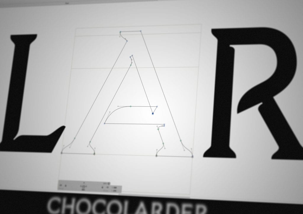
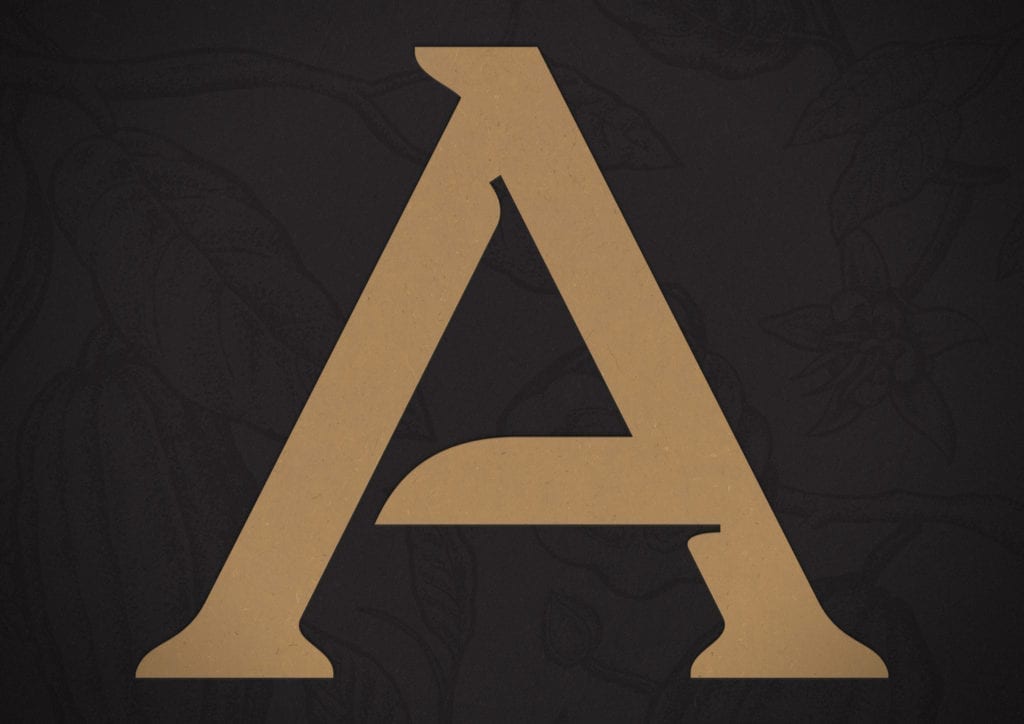
Evolving Chocolarder’s branding and packaging has included a fresh approach to its logotype.
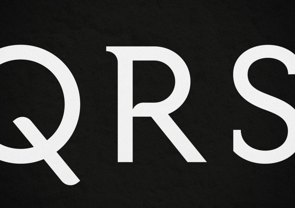
We created bespoke shapes that have a classical structure – strong, refined and true – that visually connect the name to the brand’s tireless devotion to a responsible bean to bar process, which results in the highest quality chocolate.
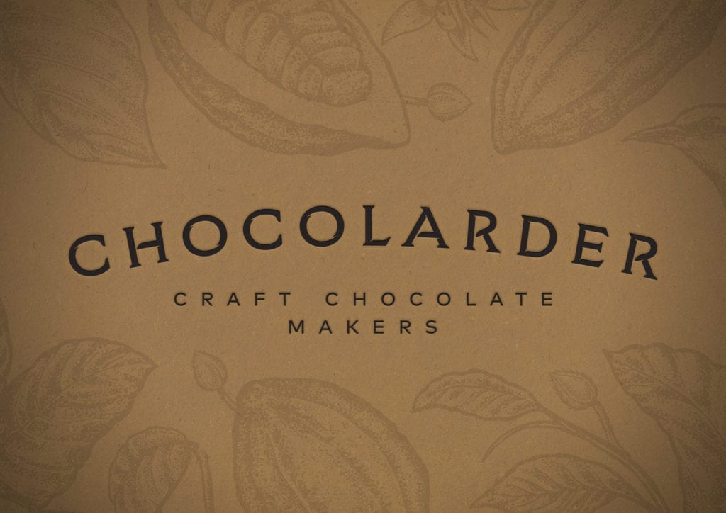
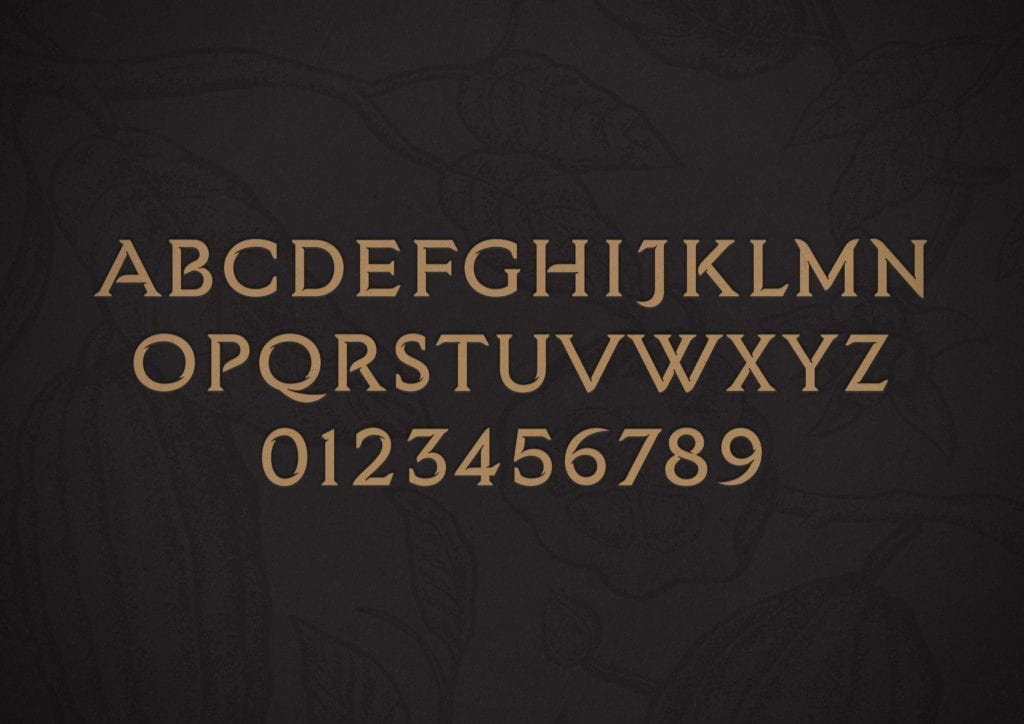
The concept of the letter shapes is all about discovering flavours. Upon closer inspection soft, curved details create a swirliness as an expression of a sensory nature when smelling and tasting the chocolate itself.
