


Explore More Work
-

Future Stitch
Creating a forward-thinking corporate brand identity for the world’s most innovative apparel manufacturer.
-
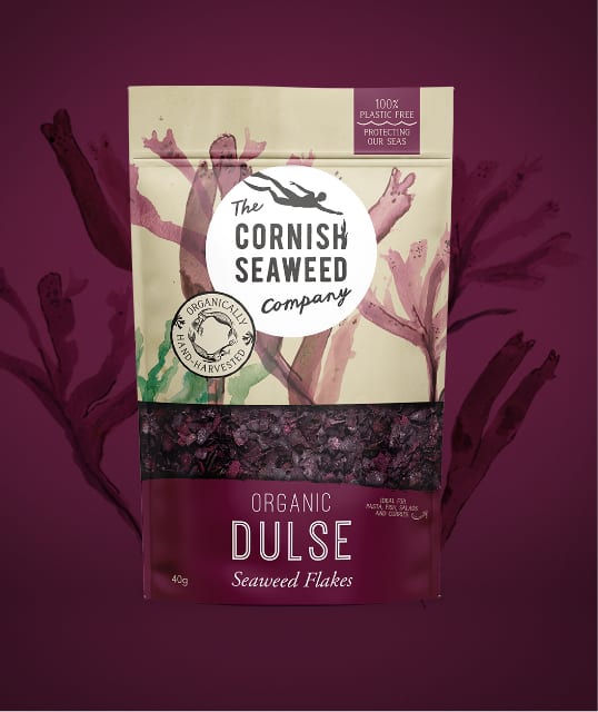
Cornish Seaweed Company
The Cornish Seaweed Company brand identity design needed to find a natural balance of health, taste and sustainability. Using hand painted assets, we developed their packaging designs.
-
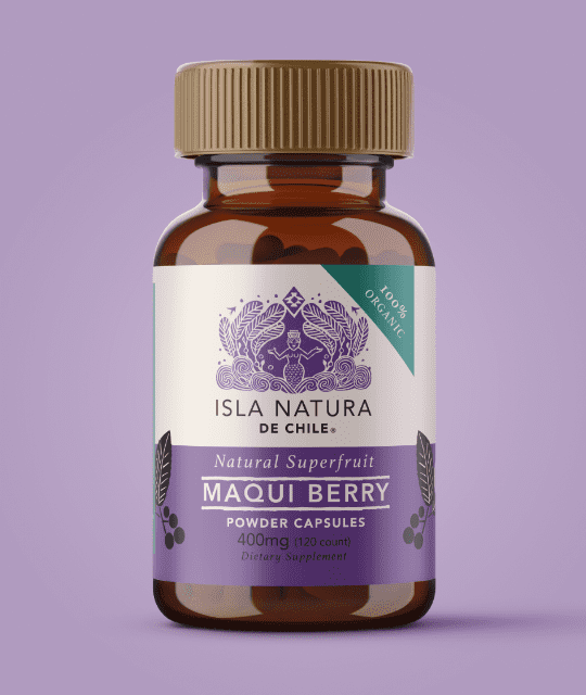
Isla Natura
Branding a Chilean superfood supplement for a Western market. Featuring colourful graphic design and illustration, Isla Natura stands out amongst competitors.


